Back to Course
20. NCS in kitchen studios III
0% Complete
0/0 Steps
Lesson 2 of 4
In Progress
NCS designation based on pictures
You are currently viewing a placeholder content from Vimeo. To access the actual content, click the button below. Please note that doing so will share data with third-party providers.
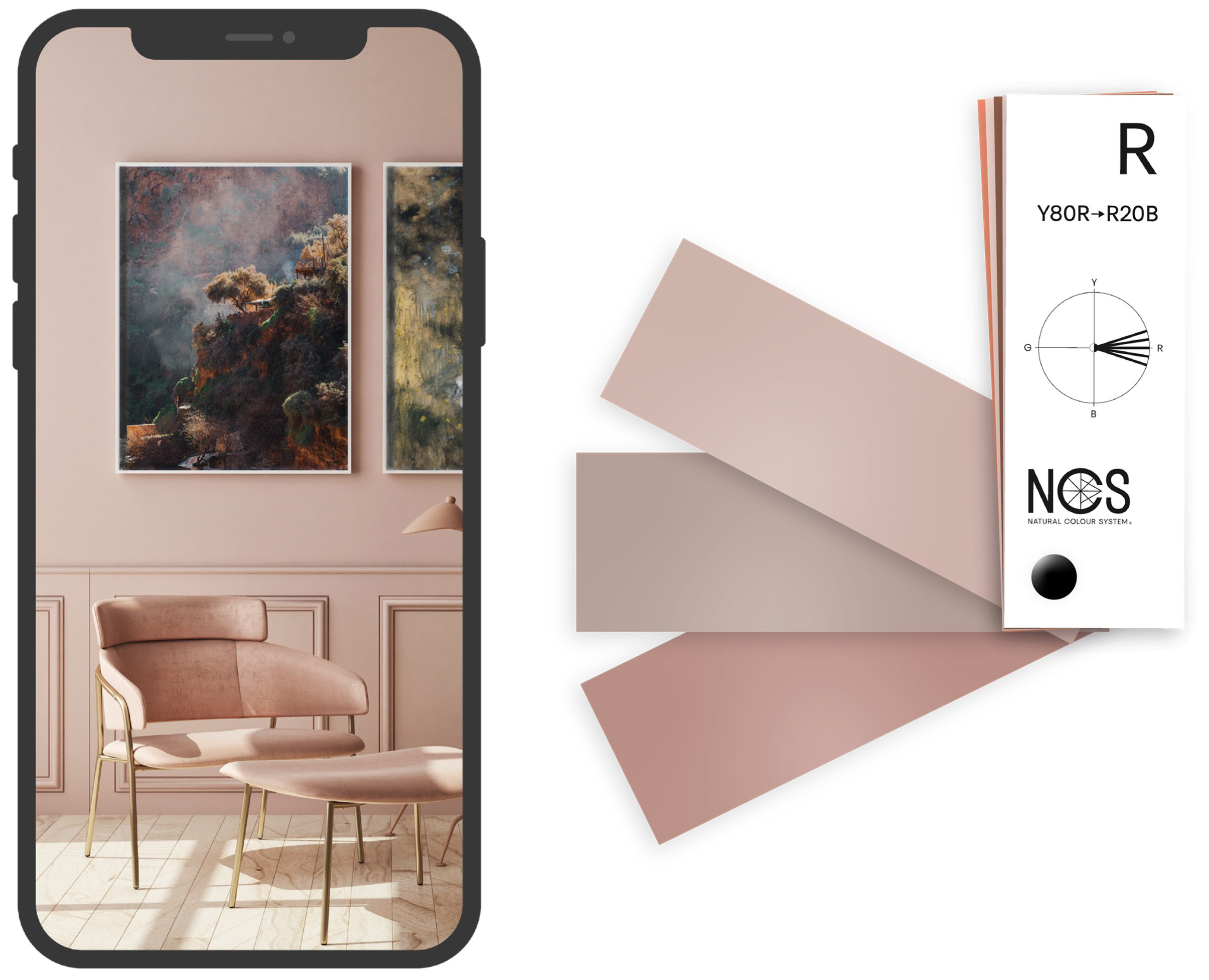
More Information One of the most common questions customers ask us today is that they would like to have the same color on their wall that they have seen on social media.
There is a solution for this case too.
When we take on this challenge, it doesn’t mean we can figure out the actual inherent color of the wall in the picture, but we can understand the color we see in the picture. All colors look different depending on the screen, the actual lighting conditions in the room and the filter that has sometimes been placed over the images.
If a customer comes in with a photo that they took themselves, ask them if they like the color in the picture or the color they saw in real life. If he prefers the color he saw in real life, you need to measure it and adjust it so that it looks the same in his room.
But if he likes the color in the picture, you can help him understand what color it is.
In this case, we deal with the complexity of capturing the perceived color in an image and then adjusting it to fit the client’s space, taking into account the color shifts.
Step 1
Start by understanding the color in the picture. In this case, it is a pink-looking color. First assess whether it is a pink rather yellowish-red or bluish-red. Use the NCS block or the navigator in the NCS+ app to navigate more easily.
You can use the NCS+ app free of charge.
You can use the NCS+ app free of charge.


Step 2
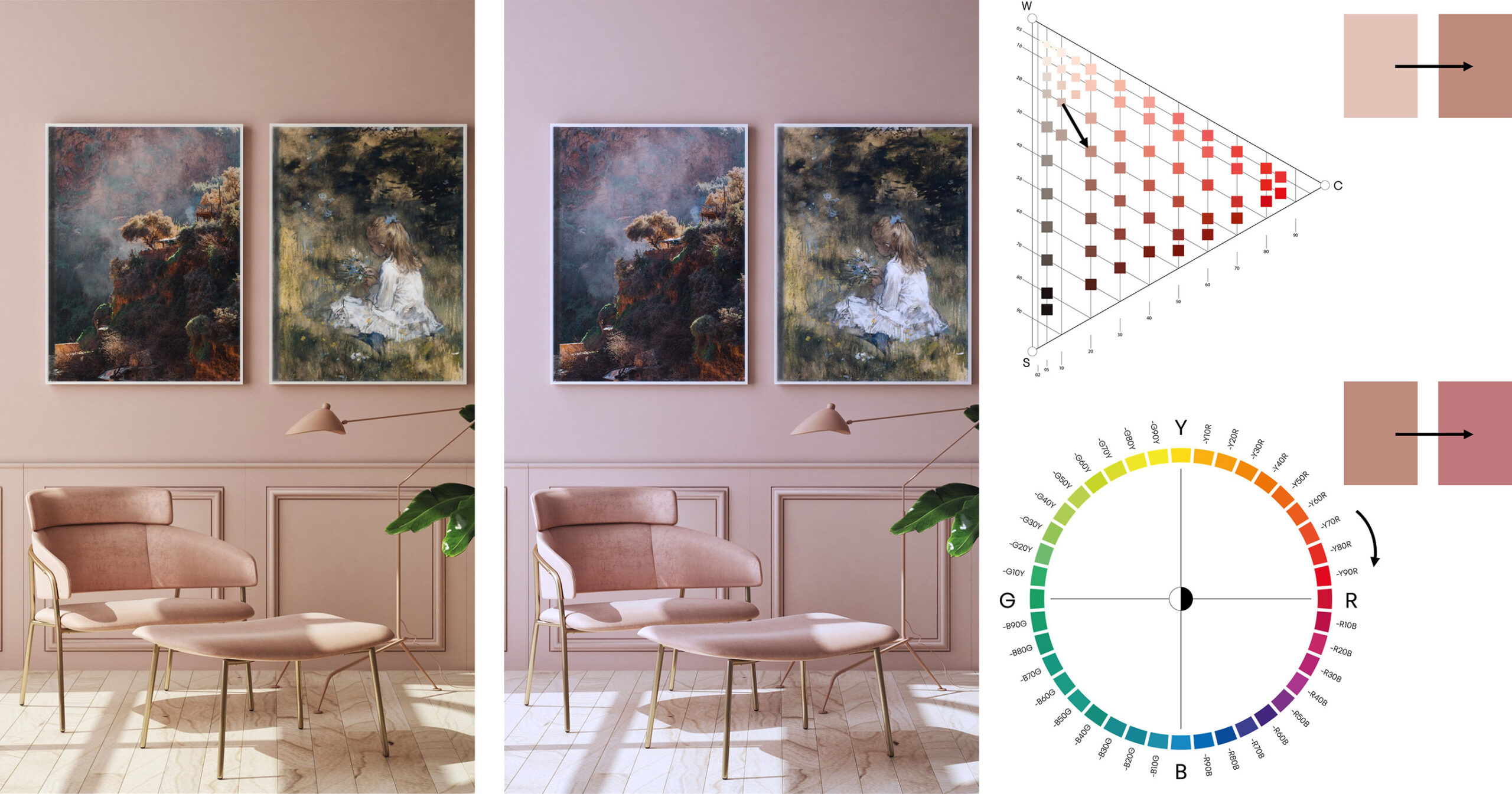
Select your starting point, in this case 3020-Y80R. From here you need to match the color difference between a color sample and a painted wall. If you want the shade to look like 3020, you need to look at 2010. How much you need to adjust the shade depends on how much light is coming into the room. If there is a lot of light, you may not need to adjust the shade as much as in rooms with less light.

Step 3
Once you have adjusted the shade, you may need to adjust the hue. Depending on the lighting conditions in the client’s room, the hue may shift and the color will look different. Pink colors move towards red in both warmer and colder lighting conditions when closer to R. Keep in mind that warmer, yellowish-pink colors will move toward yellow. You may need to compensate for this, or stay in the same hue so the color doesn’t look like a peach.
In colder light, the pink colors will look a little colder. If the client has a lot of cold light, compensate with more yellow to make it look warmer.
In the picture below, we can see that the nuance on the wall generally looks more colorful and blacker than the color sample. The hue could also become more purple and must therefore be compensated for with more yellow in the hue (except for yellowish hues in warmer light conditions).

