You just learned about the NCS System, the foundation, the NCS Notation, NCS Colour Space, NCS Colour Circle and NCS Colour Triangle. Let’s learn more about how you can use the NCS System in your colour design.
The smartness of the NCS system
Now we’re going to teach you about the practicality of the NCS System with regard to color combinations. Colors seldom live alone. You have to understand what different colors will look like together, how they harmonise. Perhaps you have a great eye for creating color harmonies, and that’s important. There are, however, certain rules we can work with. Both to create harmonious color combinations and to validate your intuitive color choices. One of these rules is called color similarities.
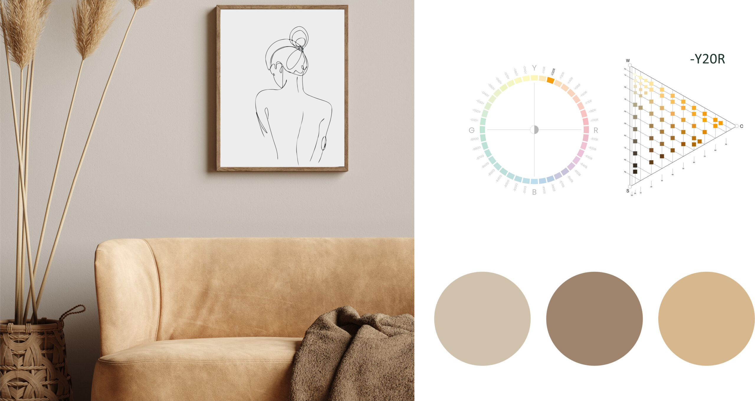
Colors in the same hue
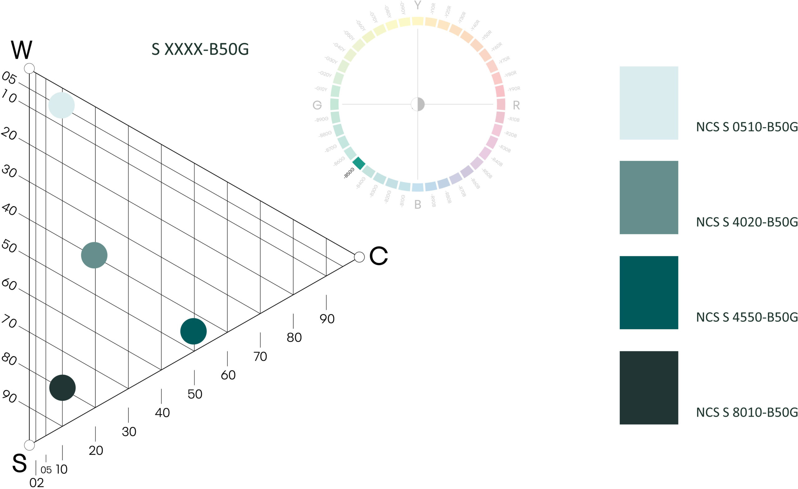
Hue similarities is one of the easiest rules. Many people know this as tone in tone combinations. Colors that belong to the same Hue will make a harmonious combination.
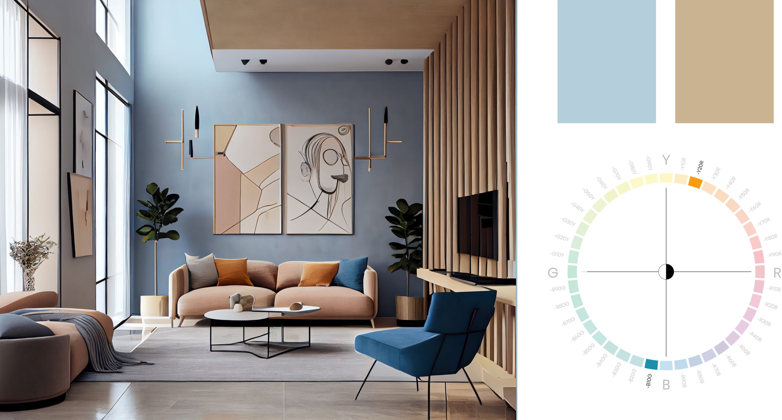
There are only shades of the hue B50G in this picture. The difference is whiteness, chromaticness and blackness. This is a simple and easy combination and suits interior design as a base wonderfully.
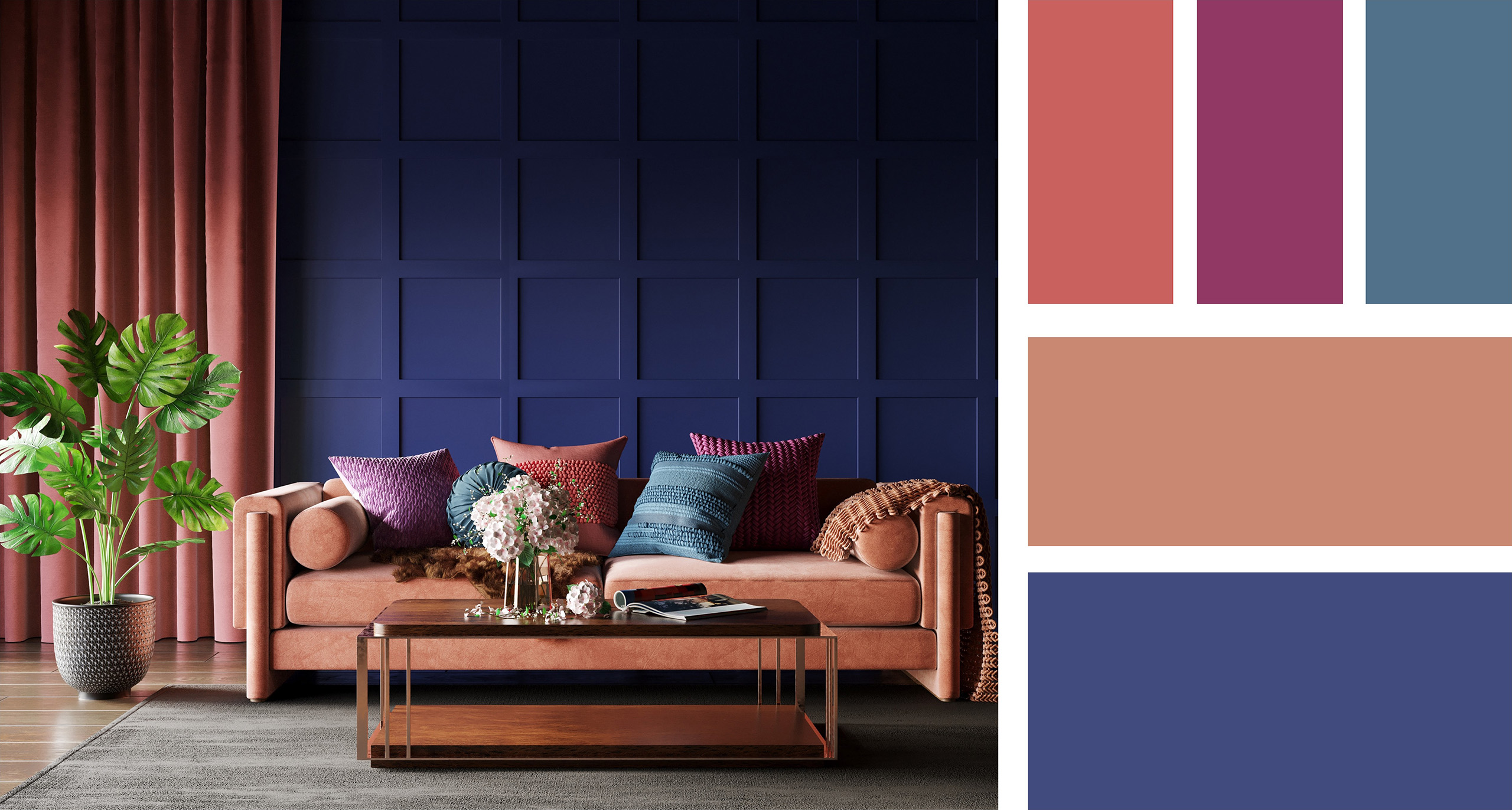
Always try to work with quite big contrasts within the hue family, to make the combination as interesting as possible. Like in this picture, the rug is pink with a lot of whiteness, while the sofa is pink with a lot of blackness and the pillows are a more chromatic pink.
Same nuance
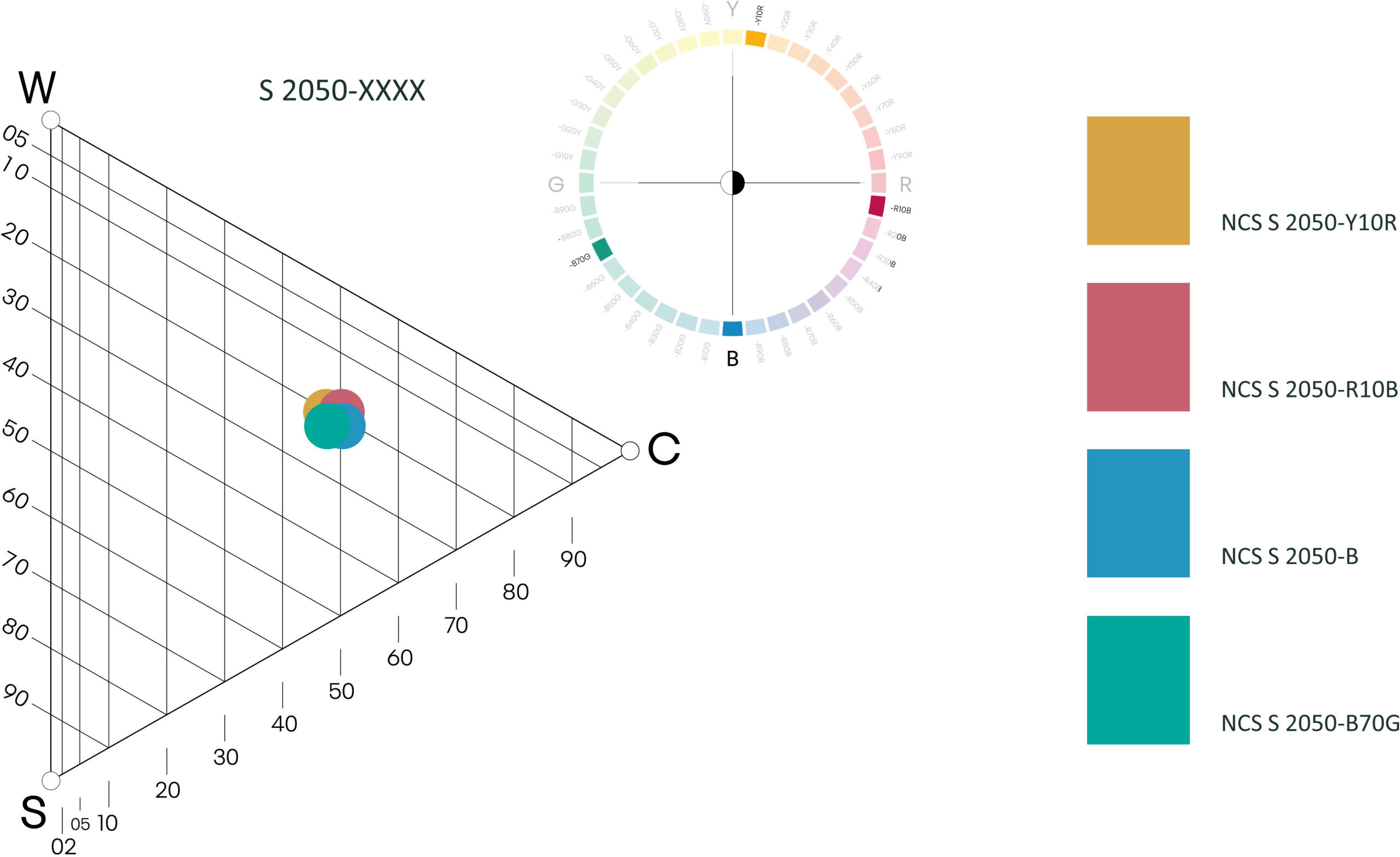
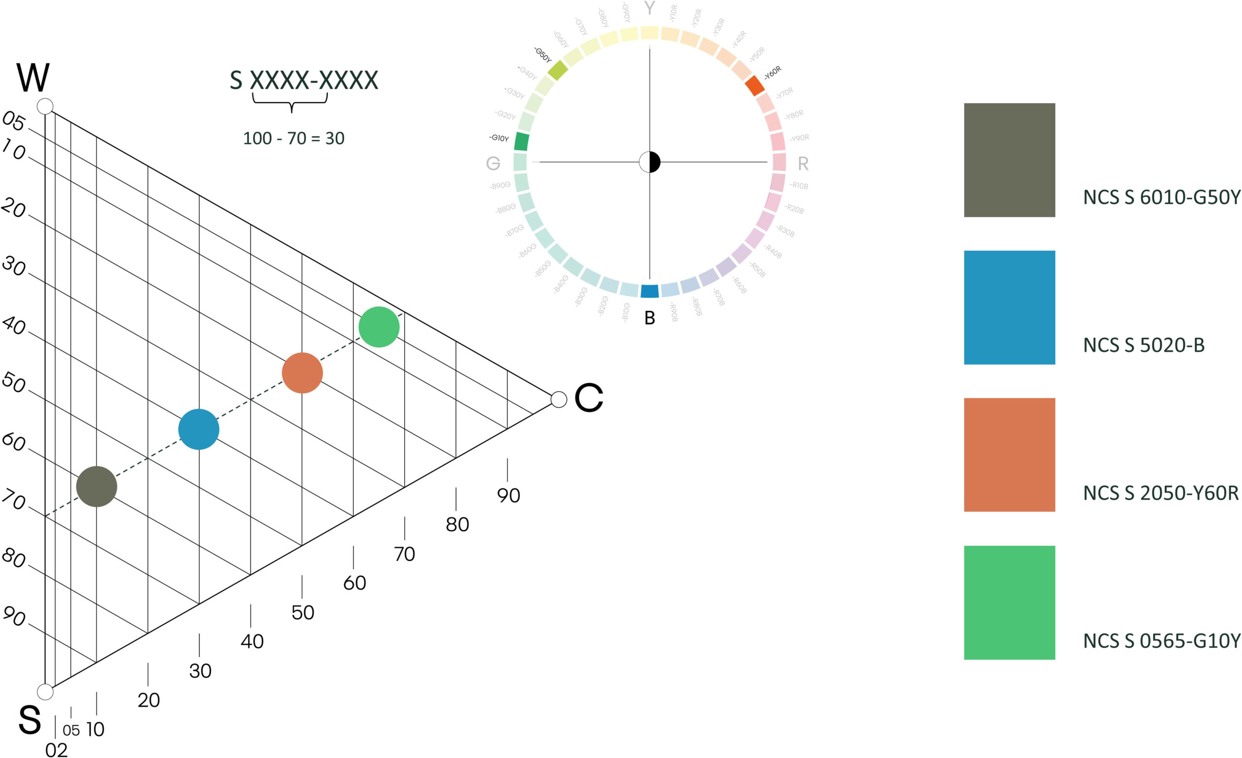
This is when you combine colors with the same whiteness, blackness and chromaticness but in different hues. Here you can see that they all share the same nuance: 2050.
This is a common combination used in product ranges, where the individual products stand out, but at the same time they are united by nuance.
Similarity in nuance can be a little flat when used in interior design. A lot of the time it feels like something is missing. But when it comes to product ranges, it’s very nice and harmonises well together.
Blackness similarity
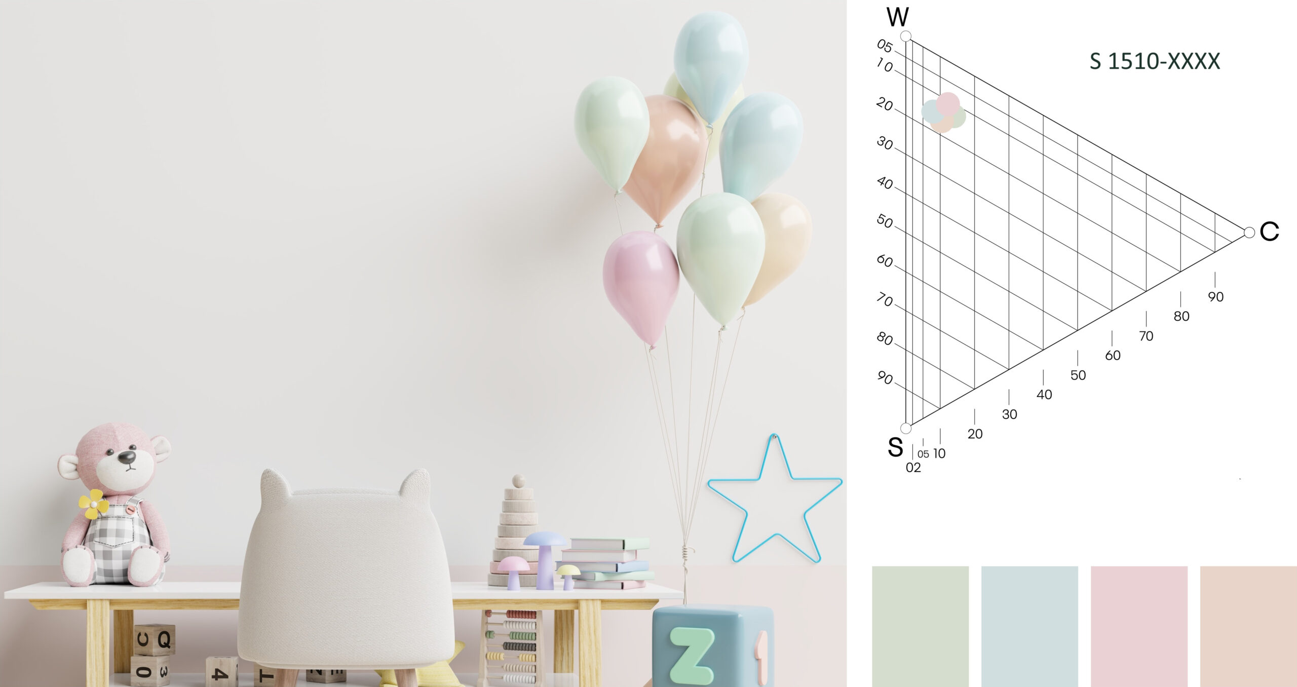
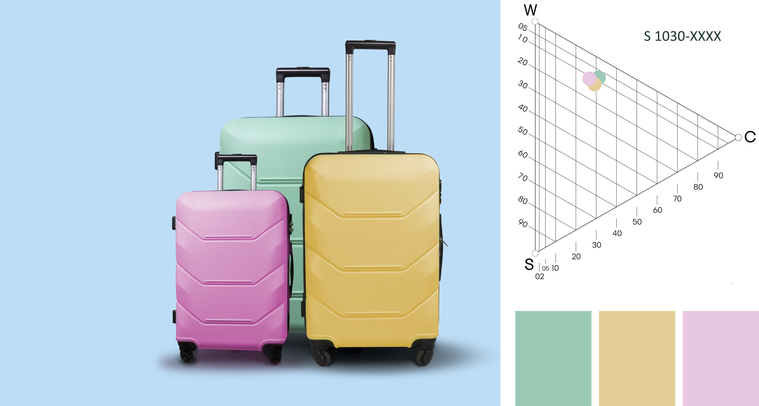
When you only choose one of the three nuances as a similarity, your options are much greater. This also means that you need to work with your vision more to find the best combination for a specific project.
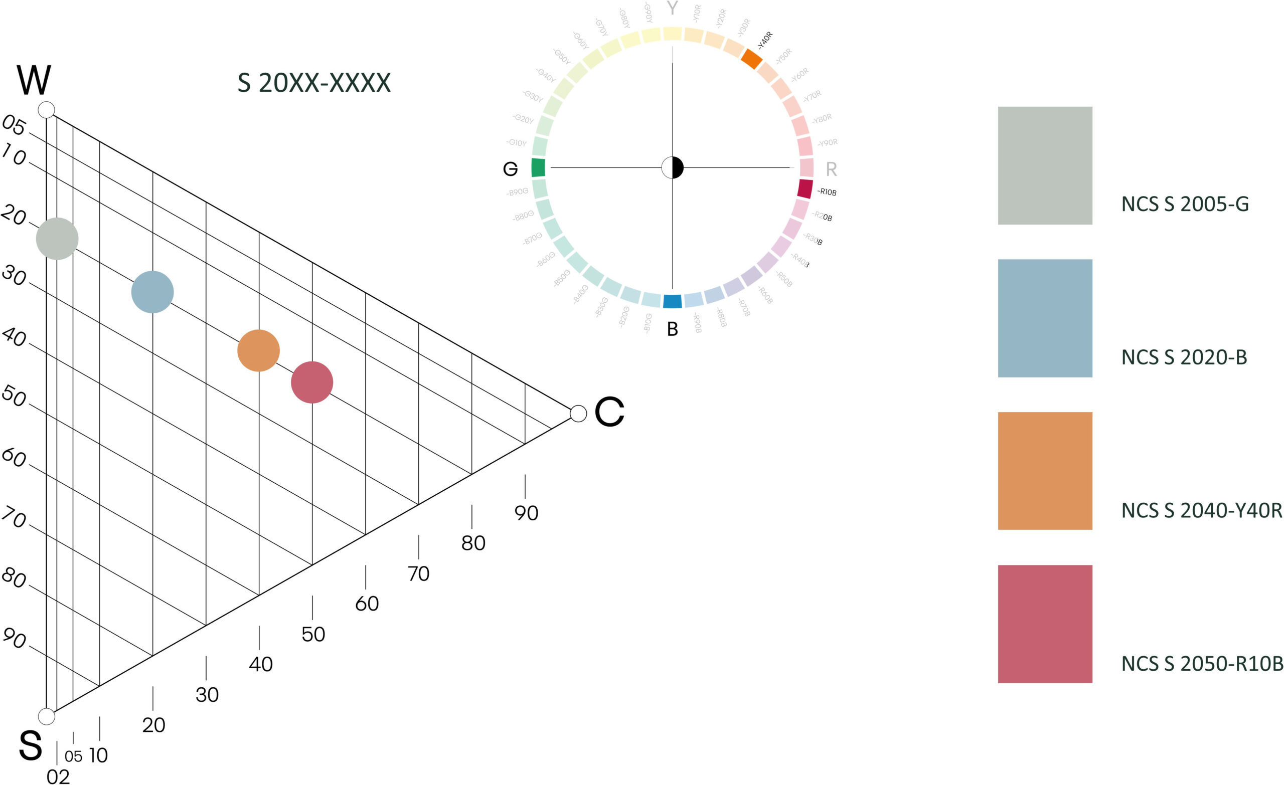
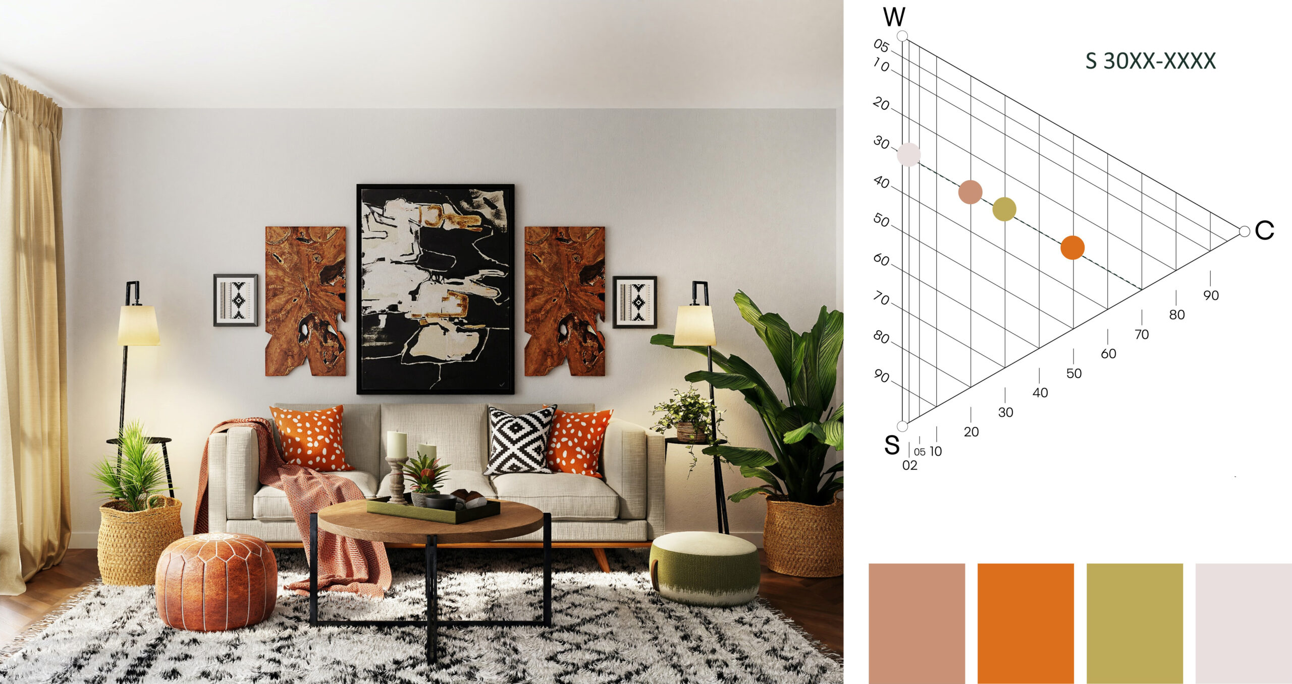
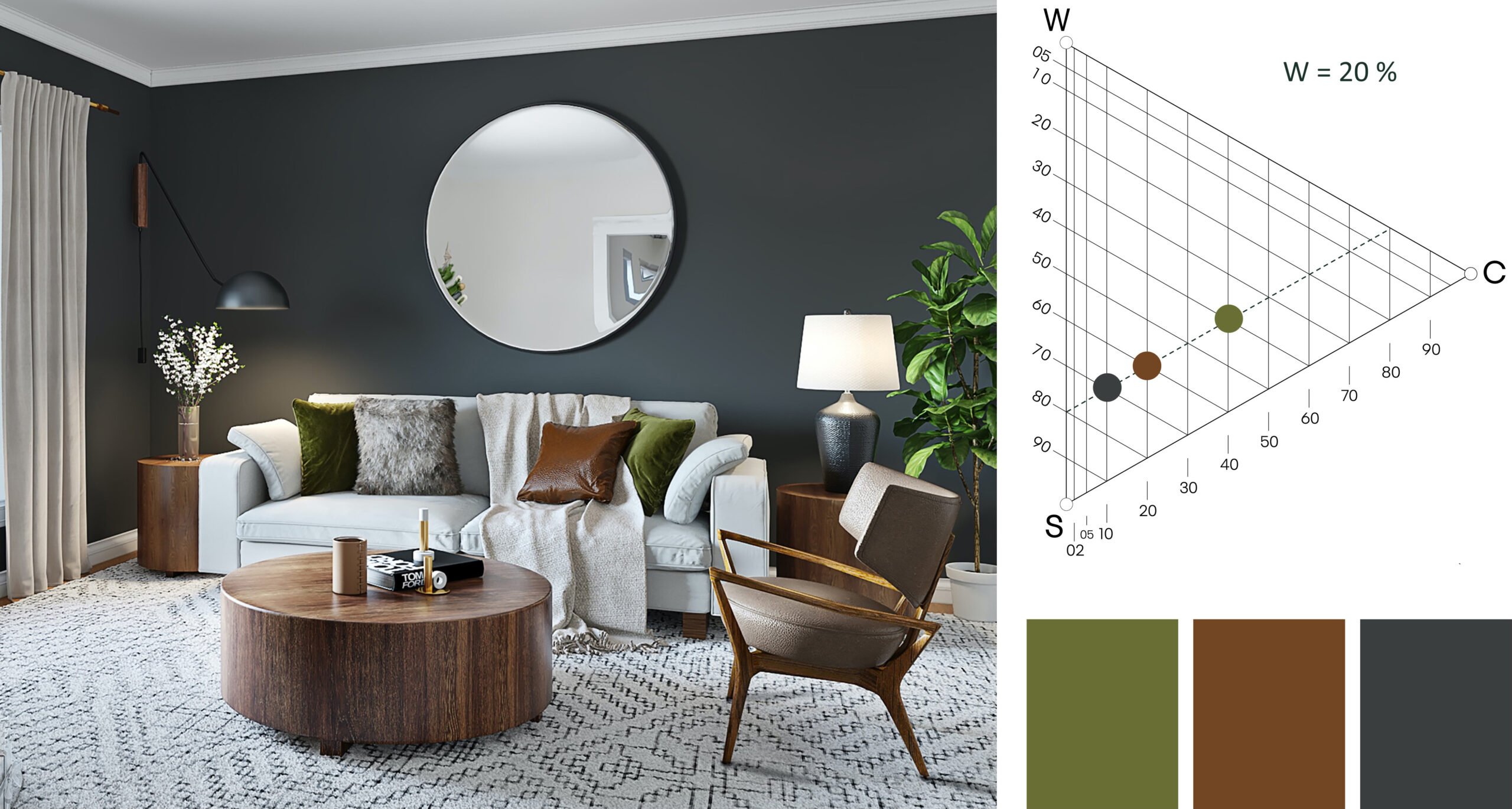
In this picture the blackness similarity is 20 (20% blackness). You can see that they have the same blackness, which creates an interesting combination. The chromaticness and whiteness are different.
In this picture the blackness similarity is 20 (20% blackness). You can see that they have the same blackness, which creates an interesting combination. The chromaticness and whiteness are different.
Similarity in chromaticness
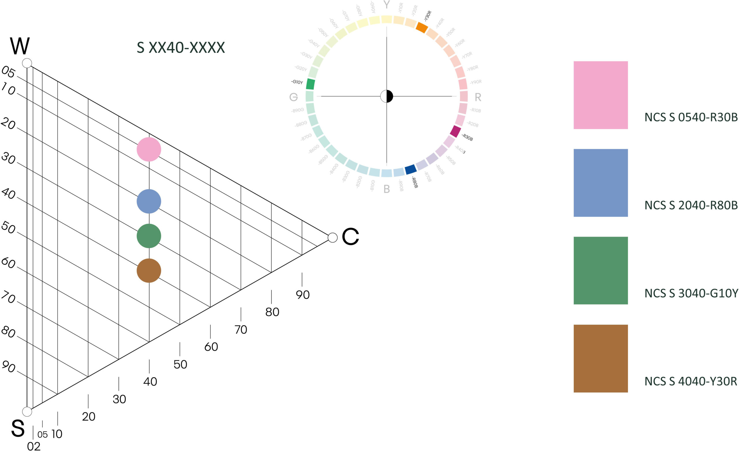
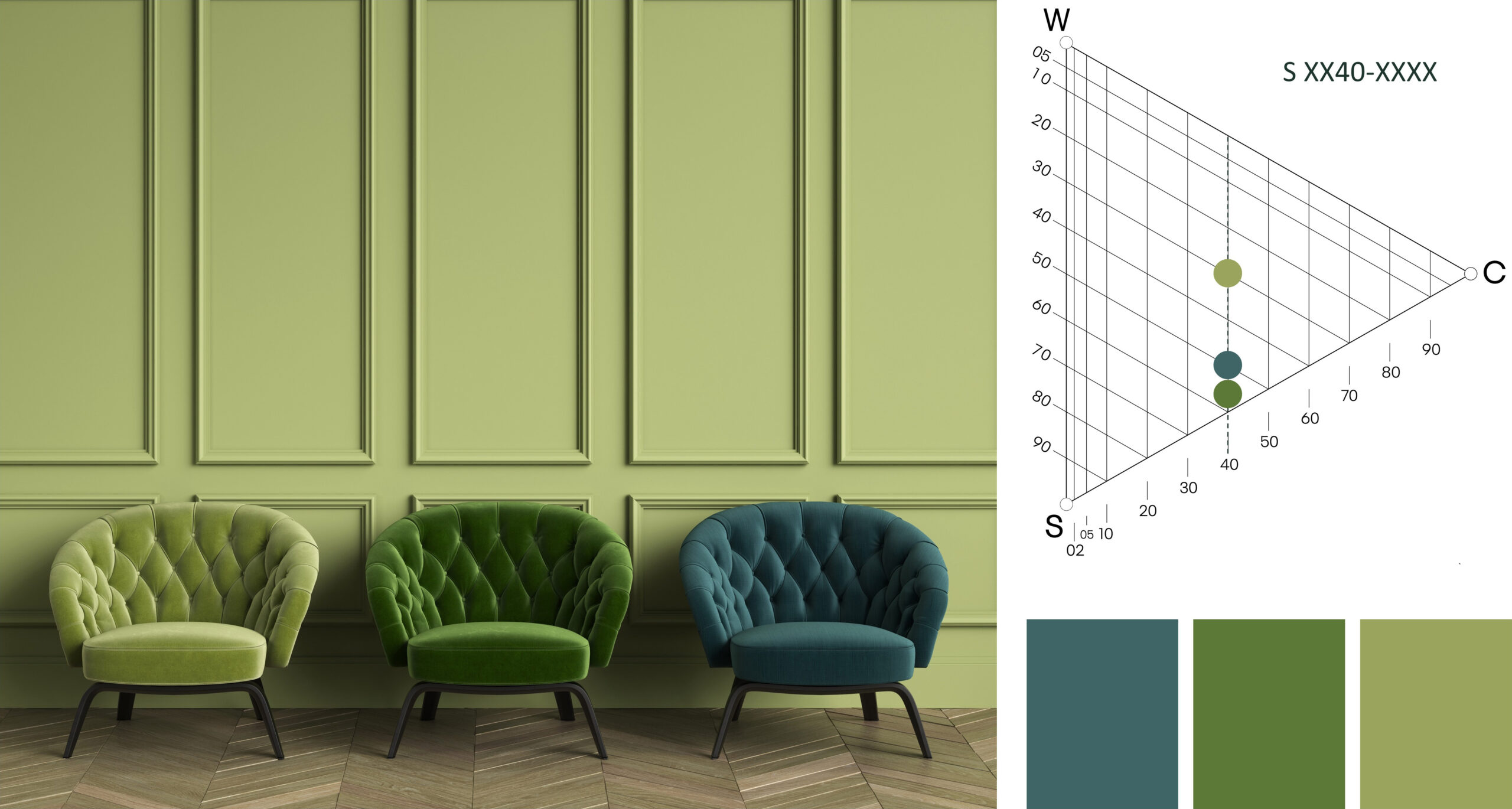
In this picture the chromaticness is 40 (40% chromaticness). Here we see the same chromaticness, which creates an interesting combination as the blackness and whiteness are different.
The three chromatic colors in the picture have the same chromaticness and therefore feel harmonious. Similarity in high chromaticness is nice as an accent combination, and similarity in low chromaticness can be applied to wall colors throughout an apartment as a pleasant common thread.
The three chromatic colors in the picture have the same chromaticness and therefore feel harmonious. Similarity in high chromaticness is nice as an accent combination, and similarity in low chromaticness can be applied to wall colors throughout an apartment as a pleasant common thread.
Whiteness similarity
We have used the same whiteness in this example, and it creates an interesting combination as the blackness and chromaticness are different. This is a combination that changes a lot depending on the whiteness value.
Closely related - 10 step rule
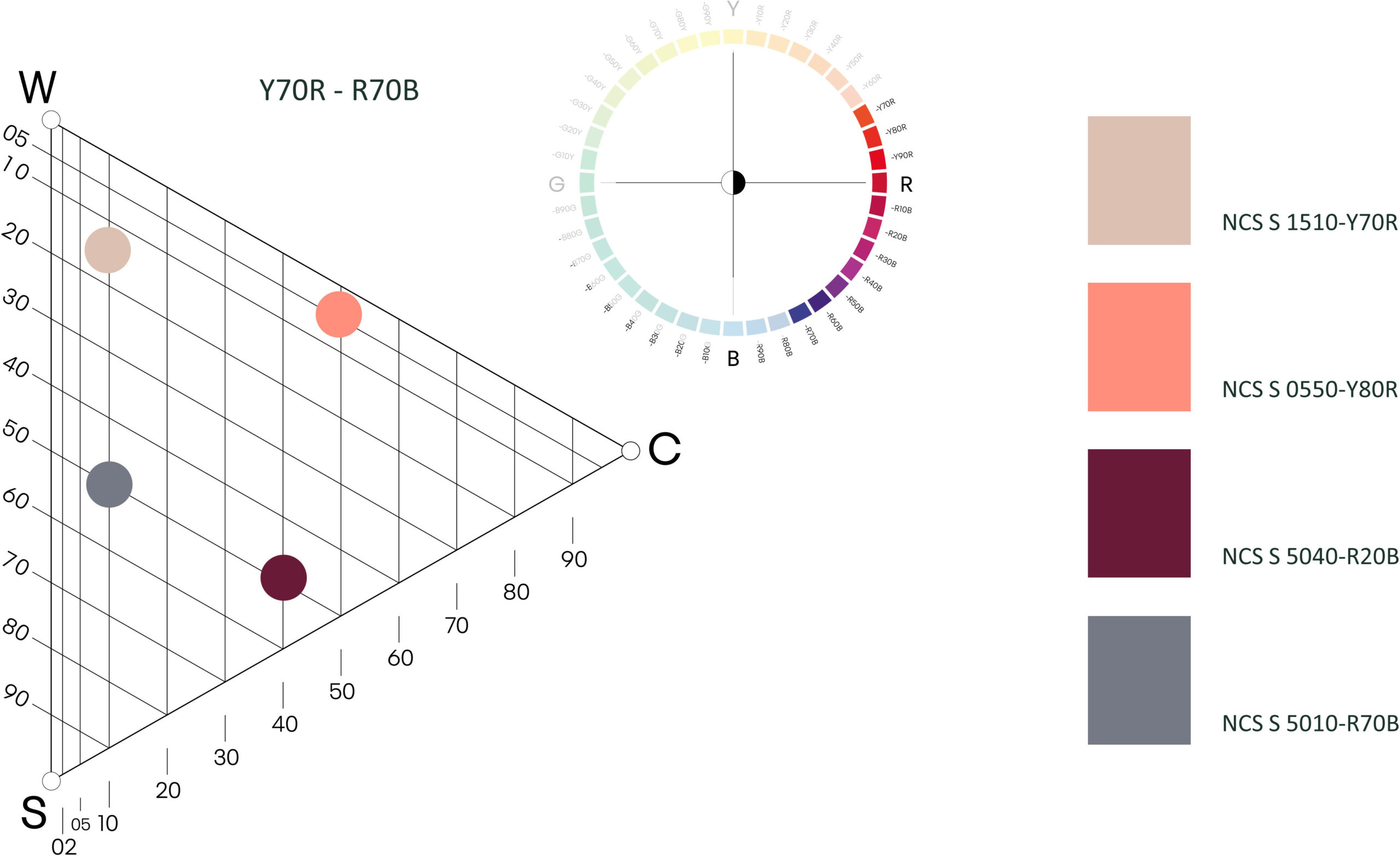
Research has shown that we perceive hue combinations as harmonious if we stay within ten steps on the NCS colour circle. What you see here is a combination of nuances within the range of Y70R to R70B on the NCS colour circle. You could also add another similarity, for example, whiteness, chromaticness or blackness, but it isn’t necessary. You will have more freedom to mix nuances when you work with closely related colours.
One idea could be to paint the walls in NCS 1510-Y70R, have a sofa in NCS 5010-R70B, a carpet in NCS 5040-R20B and cushions in NCS 0550-Y80R.
By using the 10-step rule, you are free to use products with more blackness or whiteness. It’s your choice and there are so many different options! We see this combination a lot in the cosmetics industry, in nail polish, eyeshadow and lipstick.
Complementary colors
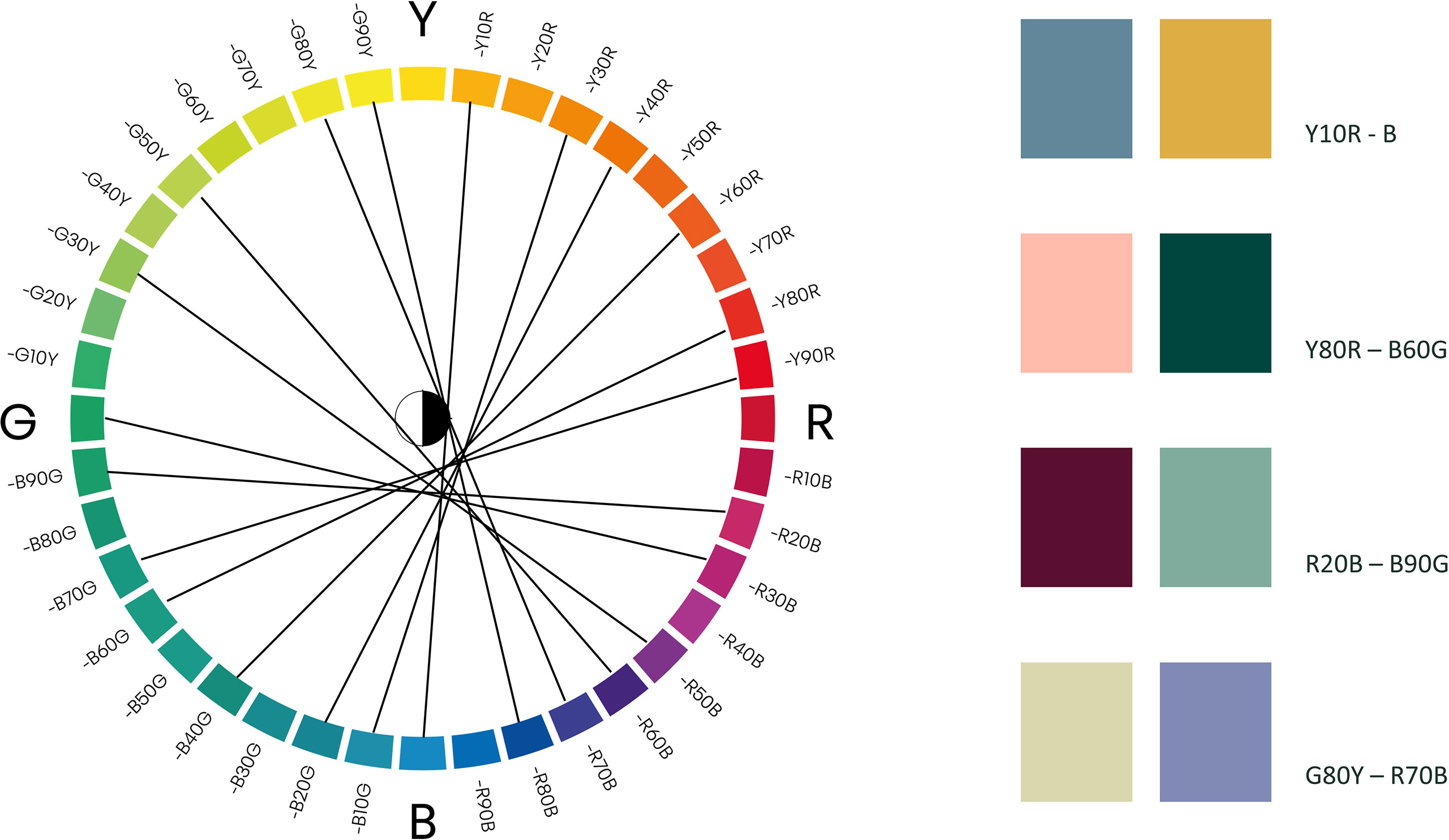
Earlier, we addressed complementary colors and how our brain naturally defines these colors for us. Complementary colors are great contrast colors, which we can work with when we want to make our design pop. To find the true complementary colors, we cannot cross through the centre of the NCS Colour Circle. The opponent colors were developed to represent true yellow, red, blue and green, but not to be perfectly complementary.
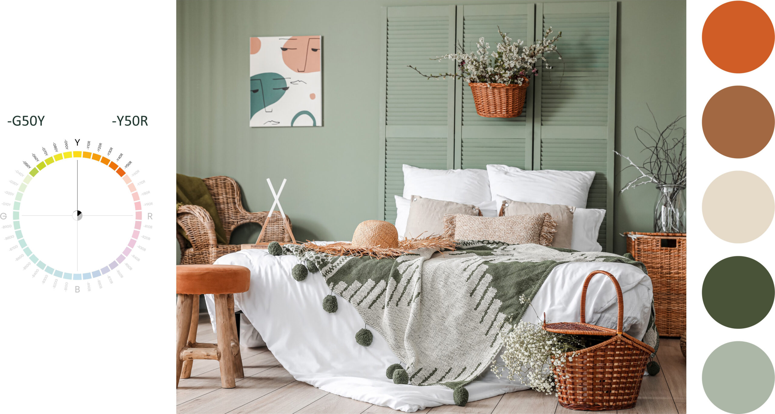
We have defined the intersection for complementary colors to the right below the central point. You can see this in this image of the NCS Colour Circle.
We are born into a natural relation with the colors of the natural world. A lot of the time, nature itself displays complimentary color combinations as if our eyes and brain were connected with nature. One very common mistake in design is when the natural color you are using doesn’t actually exist in nature. It is never enough to try and remember the colors. You need to measure the colors and match them with an NCS notation to make sure the colors you want to use to represent nature are in fact correct.
Our eyes and brain cannot be tricked by similar colors. We want the exact colors!
