Back to Course
15. NCS Basics I
0% Complete
0/0 Steps
Color is more than just beauty. There is function in every color and its context.
If colors are used in a way we are not used to see them, we might reject the color combination or at least have a harder time accepting it. The picture below is quite dramatic, but it really proves the point.

The function and meaning of color
Red in nature is usually a warning. I am dangerous. Stop! The combination of black and yellow is also a warning. A stop sign is therefore red, and many warning signs are black and yellow, or only yellow.
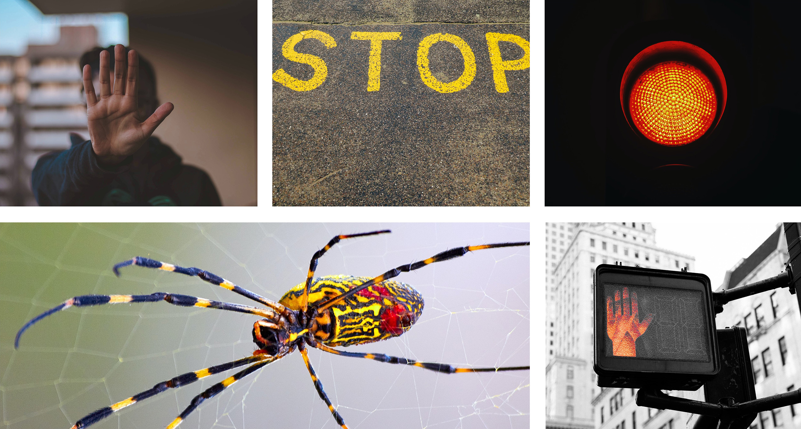
Pink instead of yellow
What would happen to your perception of danger if we were to make crime scene tape pink? Would you stay away? Probably not. In fact, you would probably be tempted to pass…

Color is always beauty and function
We use colors to make things more attractive. But the function of colors is equally important.
In public spaces, for example, we use color to make it clear where the floor is, where the wall begins, where the doors are, how to find a toilet, where to walk, where the emergency exits are, etc. This is the function of color. But also use color as a function when it comes to navigation. How to find the way in a hospital, finding your way in the subway, both through color navigation for different subway lines, but also navigation on the ground. Also, navigation in your phone on how to reach your destination, is marked in color.
In public spaces, for example, we use color to make it clear where the floor is, where the wall begins, where the doors are, how to find a toilet, where to walk, where the emergency exits are, etc. This is the function of color. But also use color as a function when it comes to navigation. How to find the way in a hospital, finding your way in the subway, both through color navigation for different subway lines, but also navigation on the ground. Also, navigation in your phone on how to reach your destination, is marked in color.
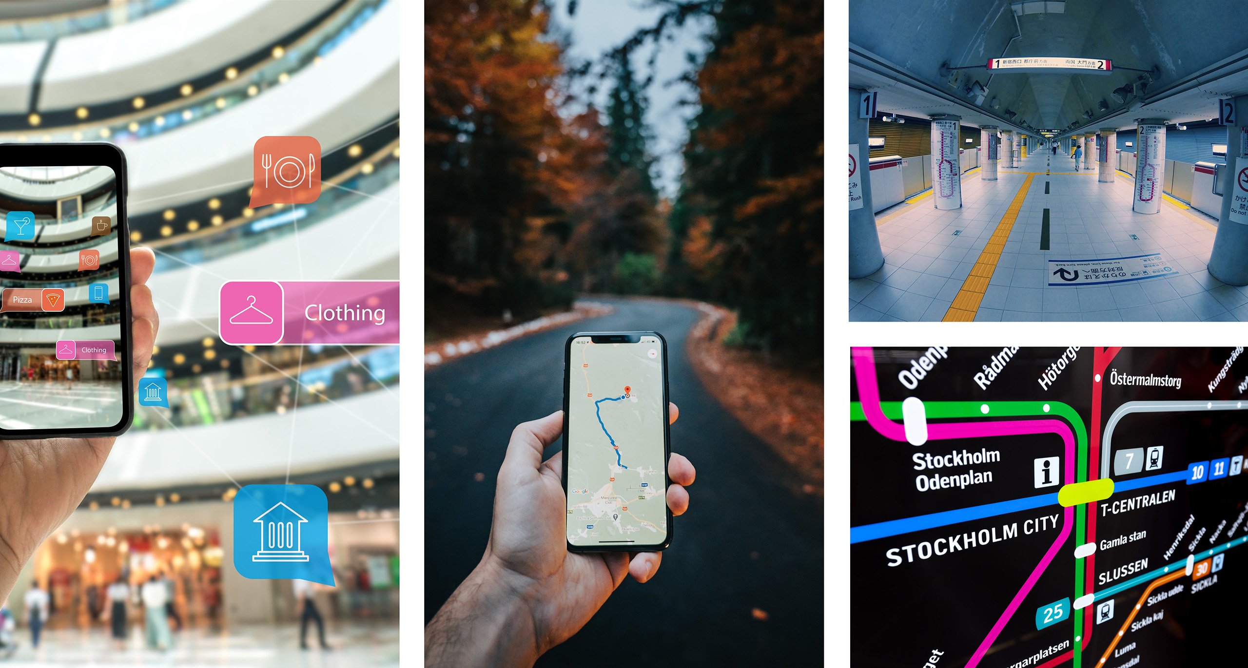
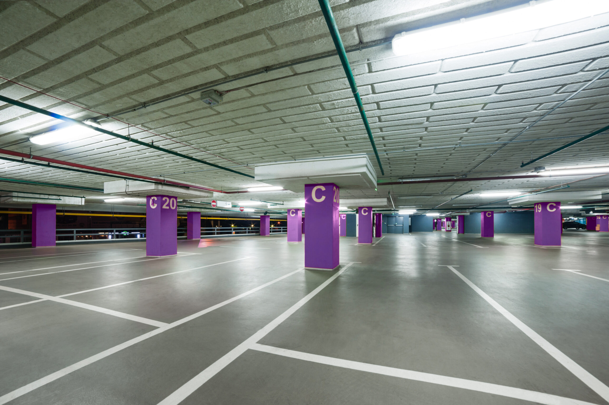
Navigation with colors could also be used in larger parking garage, to make it easier for customers to remember where they parked their car.
Is it always okay to play around with colors?
By using colors you can create shapes without altering an object. It is fascinating what you can create with colors! If you have a public space with a function for a lot of people to be in, work and visit, it is important to understand that some color compositions may create a sense of unease.
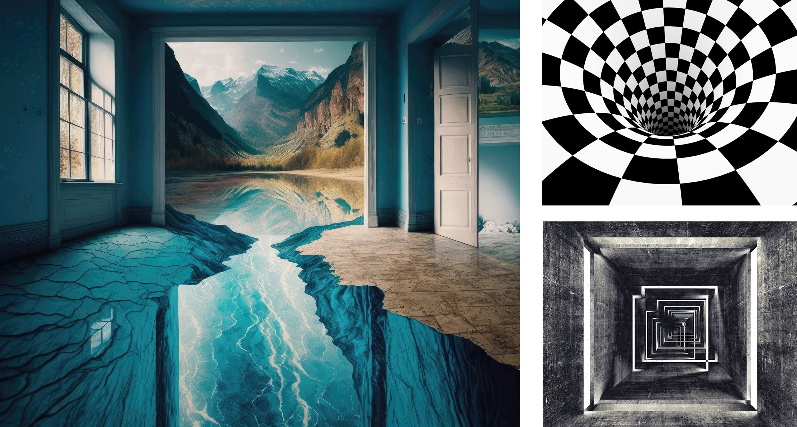
This is a hospital, the radiology department. It’s a place for people who are sick. And a lot of the time they are probably scared and don’t know exactly what’s going to happen to them.
Should this really be a place where you play around with colors and function? So the floor doesn’t look flat, for example. Could the result of these color choices actually make them feel more uneasy and scared of what’s to come?
Should this really be a place where you play around with colors and function? So the floor doesn’t look flat, for example. Could the result of these color choices actually make them feel more uneasy and scared of what’s to come?
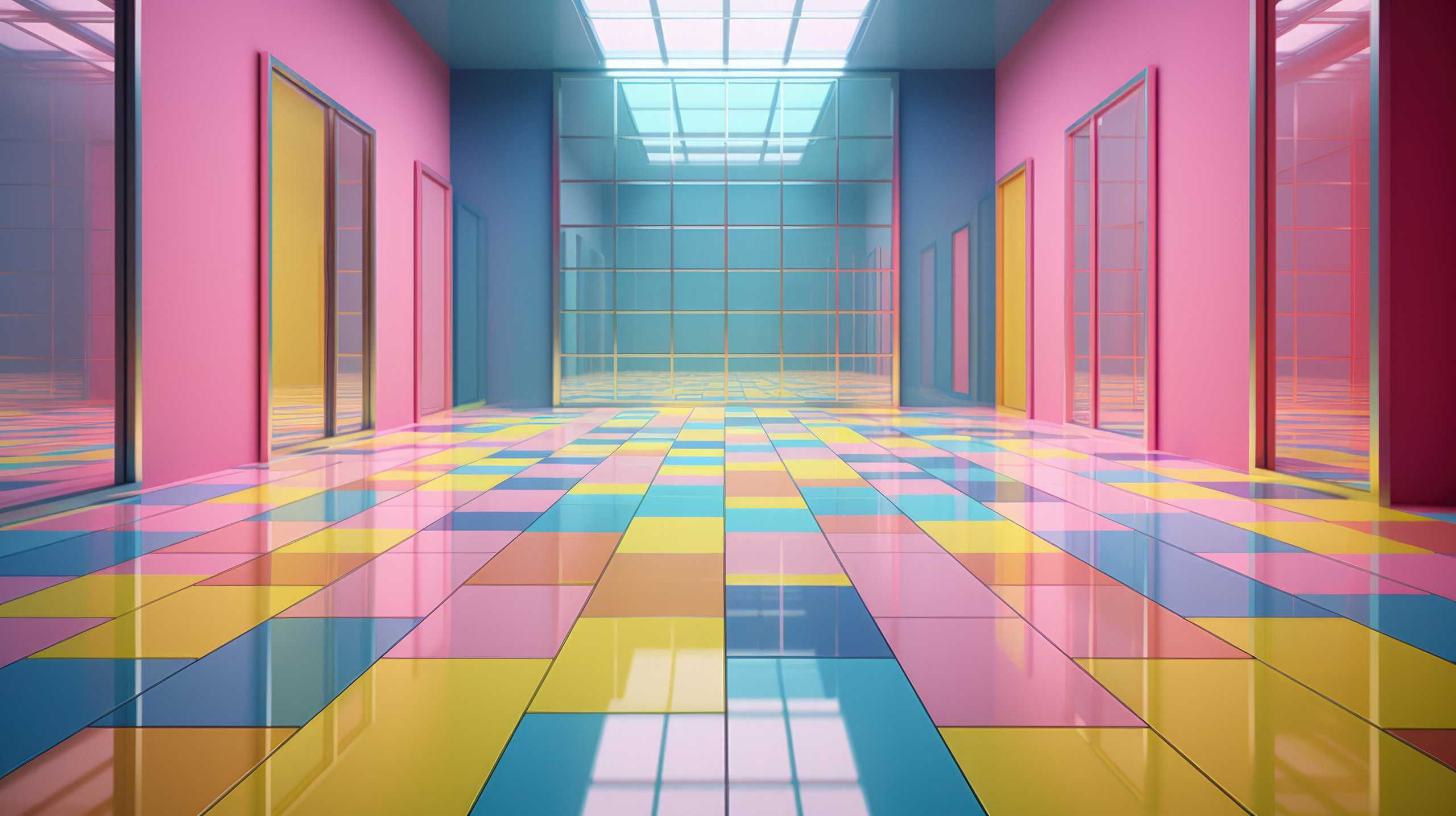
Creating color pollution?
Even though we love color, we must sometimes be careful not to use too many colors or too many chromatic colors at the same time. It can cause a strong reaction, like this hotel room in the picture above.
The use of color in design is not equal to using strong colors. It is equal to a conscious choice about which color to use. It can be white, it can be red or blue, but the choice should always be both intuitive and rational for a balanced and harmonious design.
The use of color in design is not equal to using strong colors. It is equal to a conscious choice about which color to use. It can be white, it can be red or blue, but the choice should always be both intuitive and rational for a balanced and harmonious design.
