Back to Course
18. NCS in kitchen studios I
0% Complete
0/0 Steps
Lesson 5 of 5
In Progress
Get the NCS notation

Measuring colors with NCS color samples
Place the color sample on top of the color to find the closest match in the collection. For chromatic colors, start with finding the right hue, then narrow it down to finding the right nuance. For low-chromatic colors, do the reverse: start with the nuance and then decide on the hue. Many sample collections from NCS are offered in both hue and nuance sorting for this purpose.
For multi-colored surfaces, such as wood, marble, textiles etc. it is often practical to regard them as solid for the purpose of simplifying your design work. Squint your eyes and try to match with the closest solid sample in NCS.
If, for one reason or another, you need to match a color from memory, the NCS Atlas is often the best tool. The NCS Atlas include the full range of colors in NCS with small sample of each color positioned in its correct coordinate in the NCS color space. This arrangement gives a good overview of available colors which can make it easier to visually search for the right shade. The NCS Album offers the same possibilities where you can also pick out the sample to look at isolated to make sure you avoid color pollution. However, keep in mind that accurately recollecting colors from memory is very difficult and require training as well as experience. It is always better to match visually so that you can compare both samples.
Measuring details (Interior)
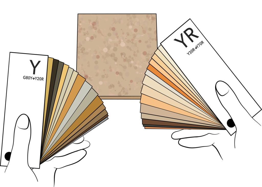
Step 1
Understand where in the hue circle the color is located.
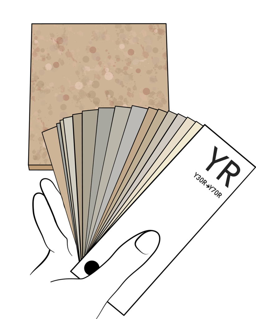
Step 2
Find out what nuance it is.
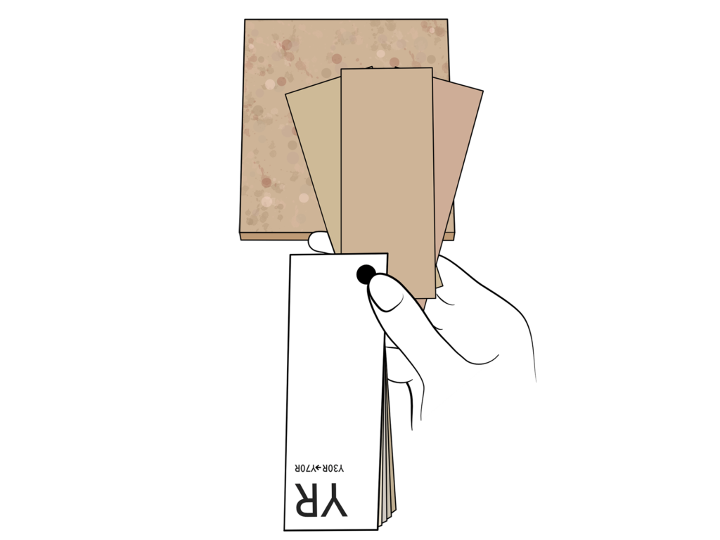
Step 3
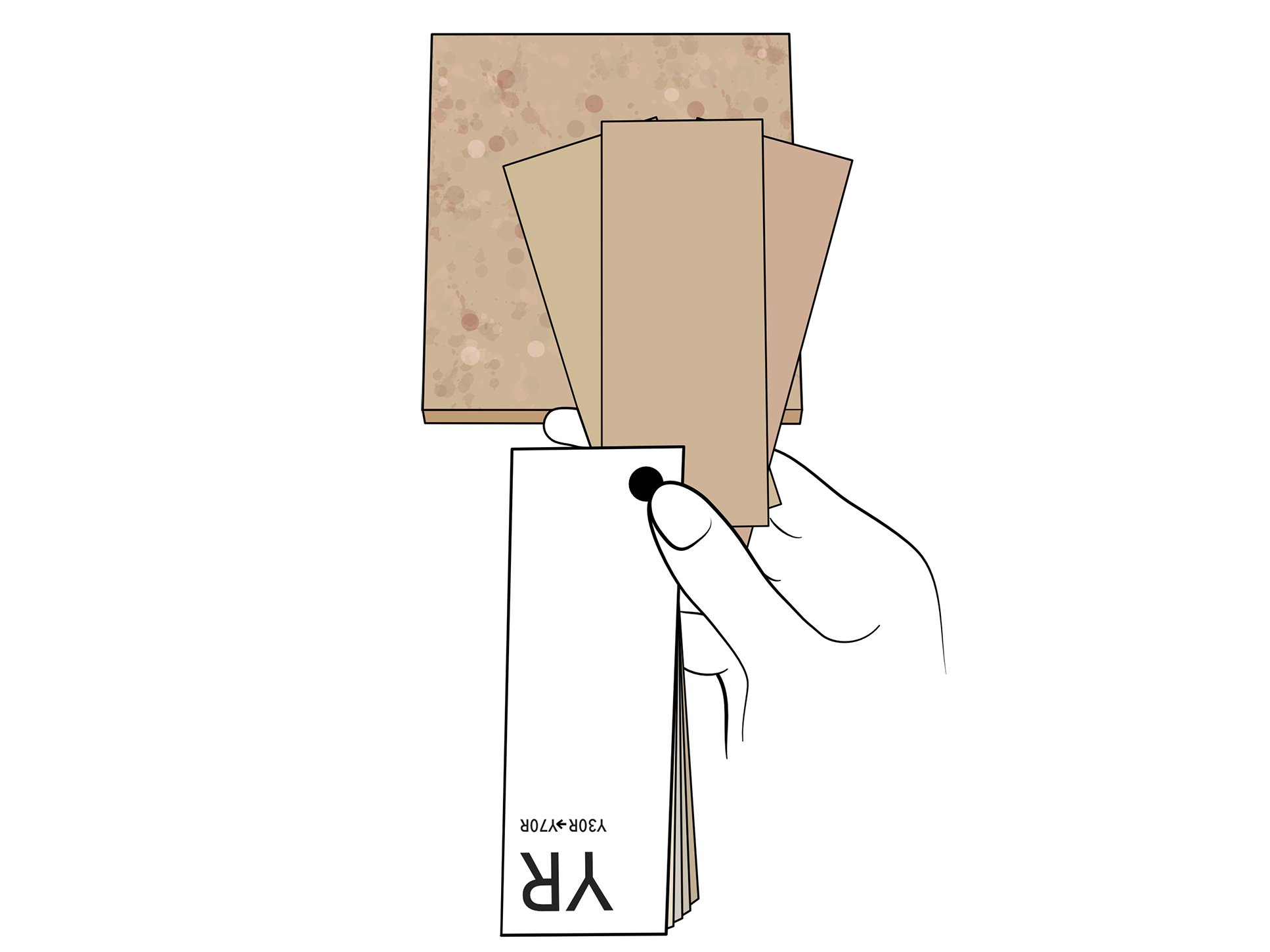
Compare the chosen nuance with the same nuance in a hue step before and after to make sure it’s the right choice.
Step 1
Understand where in the hue circle the colour is located.
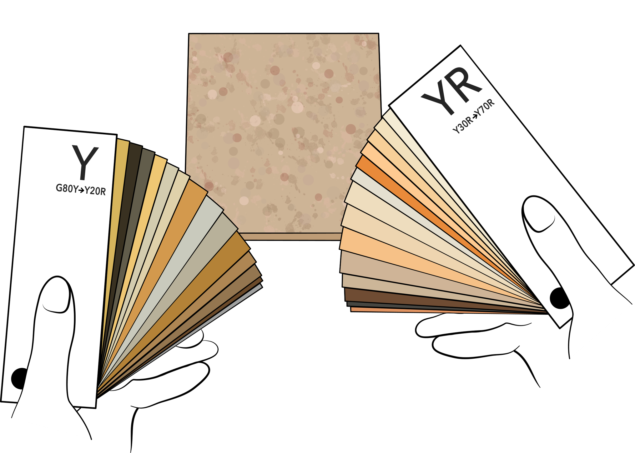
Step 2
Find out what nuance it is.
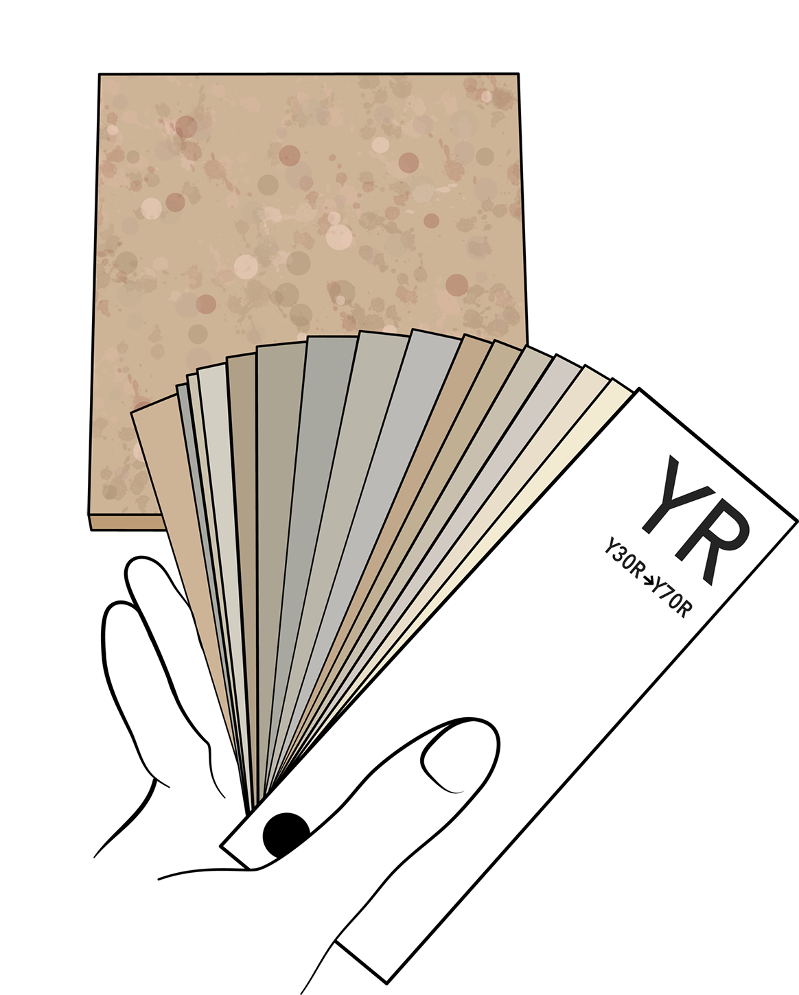
Step 3
Compare the chosen nuance with the same nuance in a hue step before and after to make sure it’s the right choice.
Measuring colors with a color reader
Color measurement instruments, color readers, provide you with the closest color match to a surface under a pre-defined viewing condition. This could for example be the average color over an 8 mm diameter area, at a 45 degrees angle to the surface, in typical outdoor lighting, at noon in the Nordic hemisphere. This may not be the exact viewing conditions in which you want to match your color. However, the benefit with using an instrument to match colors is that it is always done the same way which brings coherency and minimizes the risk of making major errors in the process.
Using an instrument is good when working with solid, opaque colors and flat surfaces, e.g. painted surfaces, stone, tightly knitted textiles, wallpaper etc.
Use readings from instruments with caution when working with surfaces that are semi-transparent such as glass or plastic, with rough surfaces such as rugs, or for surfaces with patterns such as wood or marble.
Tools
• NCS Colourpin – A pocket size color reader with a mobile app & NCS 1950 database.
• NCS Colour Scan – A stand-alone color reader with NCS 1950 database.
• NCS Colour Scan – A stand-alone color reader with NCS 1950 database.
Method
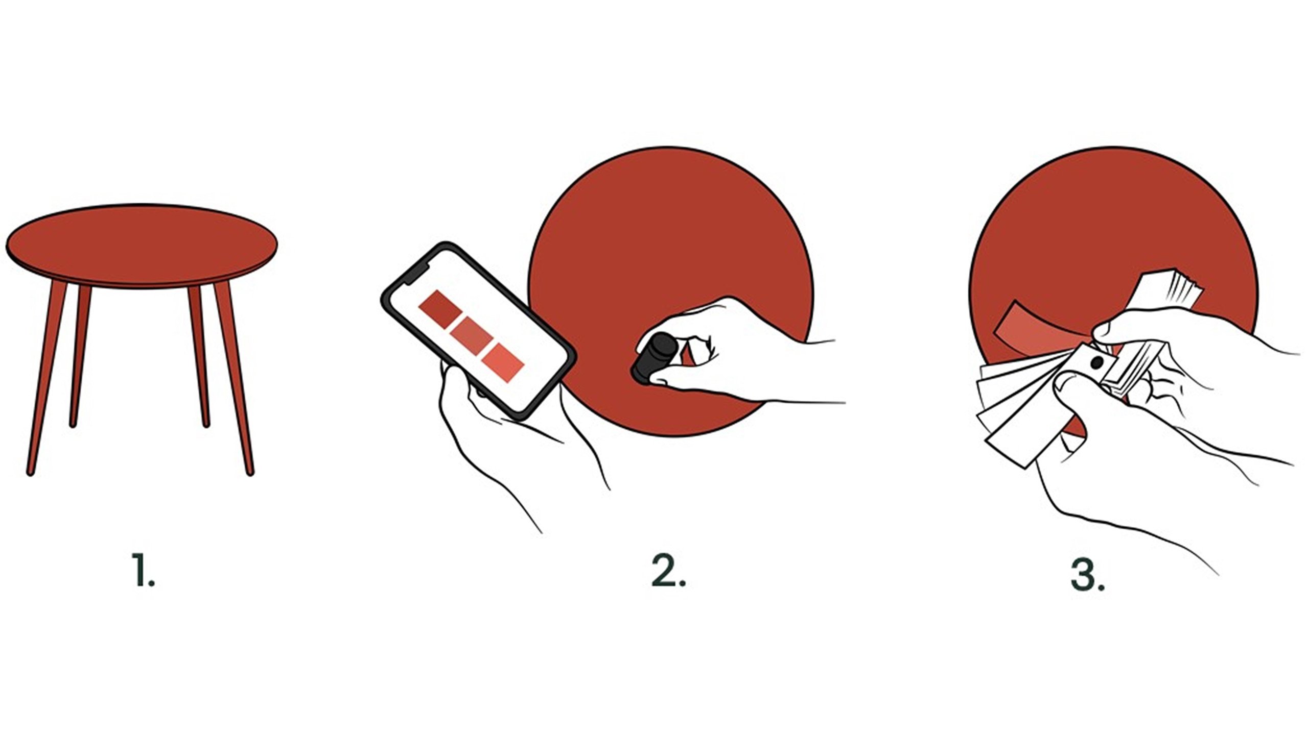
1. Decide where to measure on the object or surface based on the limitations of color measurement instrument as described above.
2. Make a measurement and check the closest match.
3. Control the result using a physical sample. This is important especially when matching a surface that is rough, transparent, not flat, etc. A useful strategy to get more accurate result on such surfaces is to measure several times and use an average.
Analysing a color with instrument
Analysing color from a perceived color - Interior
Often a client might find an inspiration picture, perhaps from a magazine, Pinterest or so on. The hard part is understanding which inherent color it is. It’s also worth reflecting that even though you know what the inherent color is, that inherent color might not be the best for your client’s space.
The first step is to figure out the perceived color. If it’s a magazine you could measure the printed color in the magazine to get a hint of the color. If it’s digital, you start trying to analyse which hue the color belongs to. Then start analysing how chromatic the color might be and the blackness of the color. Find the color sample and look at it, does it look like the perceived color?
If not, continue the search until you find a sample as close to the perceived color as possible.
Now, it is important to remember that the perceived color is generally more blackish and more chromatic than the inherent color when painted on a wall. If the client wants the same perceived color as in the picture, you need to adjust the blackness and chromaticness. But there is one more important step. Try to understand how the light and surroundings could influence how the color looks, for example, a color may appear more blueish because of the daylight.
Finally, you also need to understand if the client’s surroundings will affect the perception of the color and therefore adjust the hue too.
Let’s look at an example:
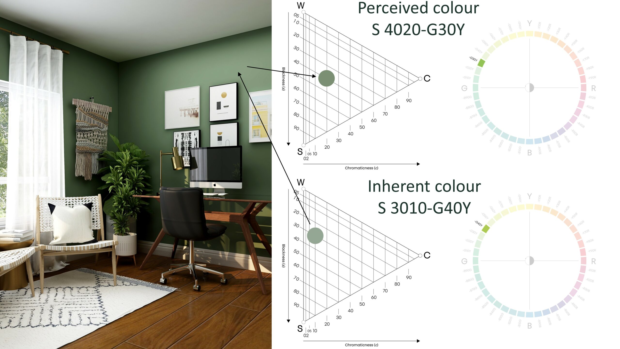

Your client loves the green color of this room and would like the same color for their space.
Step 1: Understand the perceived color, what does it look like?
Step 2: Remove some blackness and some chromaticness.
Step 3: Adjust your hue after the directions of the windows, like adding more yellowness to the hue when facing north.
Step 1: Understand the perceived color, what does it look like?
Step 2: Remove some blackness and some chromaticness.
Step 3: Adjust your hue after the directions of the windows, like adding more yellowness to the hue when facing north.
