Back to Course
18. NCS in kitchen studios I
0% Complete
0/0 Steps
Lesson 4 of 5
In Progress
Interior color design
You are currently viewing a placeholder content from Vimeo. To access the actual content, click the button below. Please note that doing so will share data with third-party providers.
More Information The NCS System has a smartness helping you to create color combinations by using similarities. Color similarities is when colors have something in common with each other, like the same hue or the same nuance. When colors are combined with these similarities, we usually find them harmonious. This is easily created when you know the NCS System.
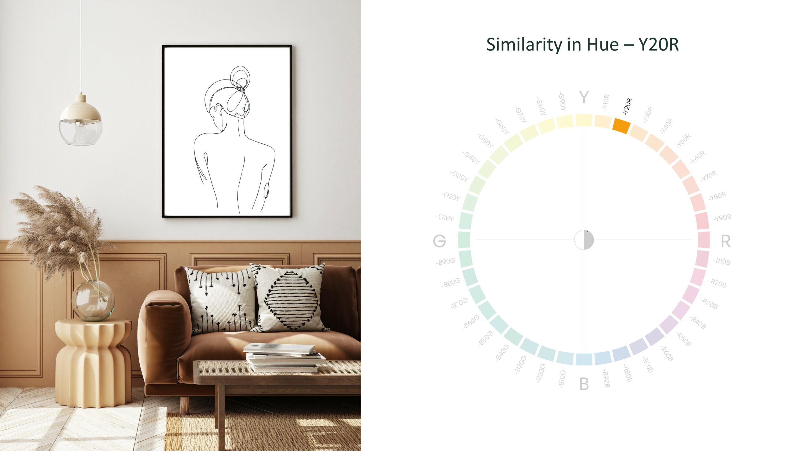
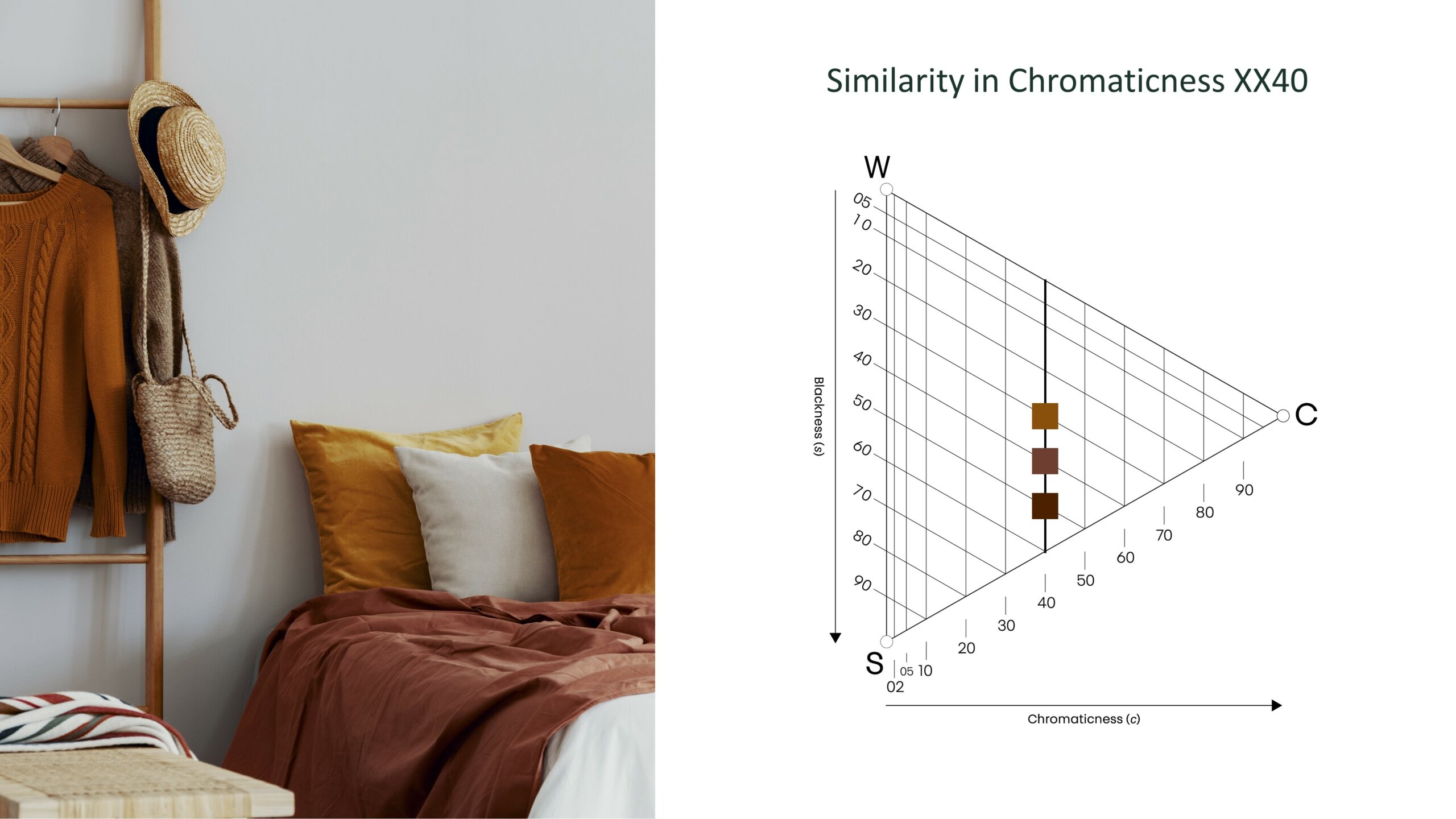
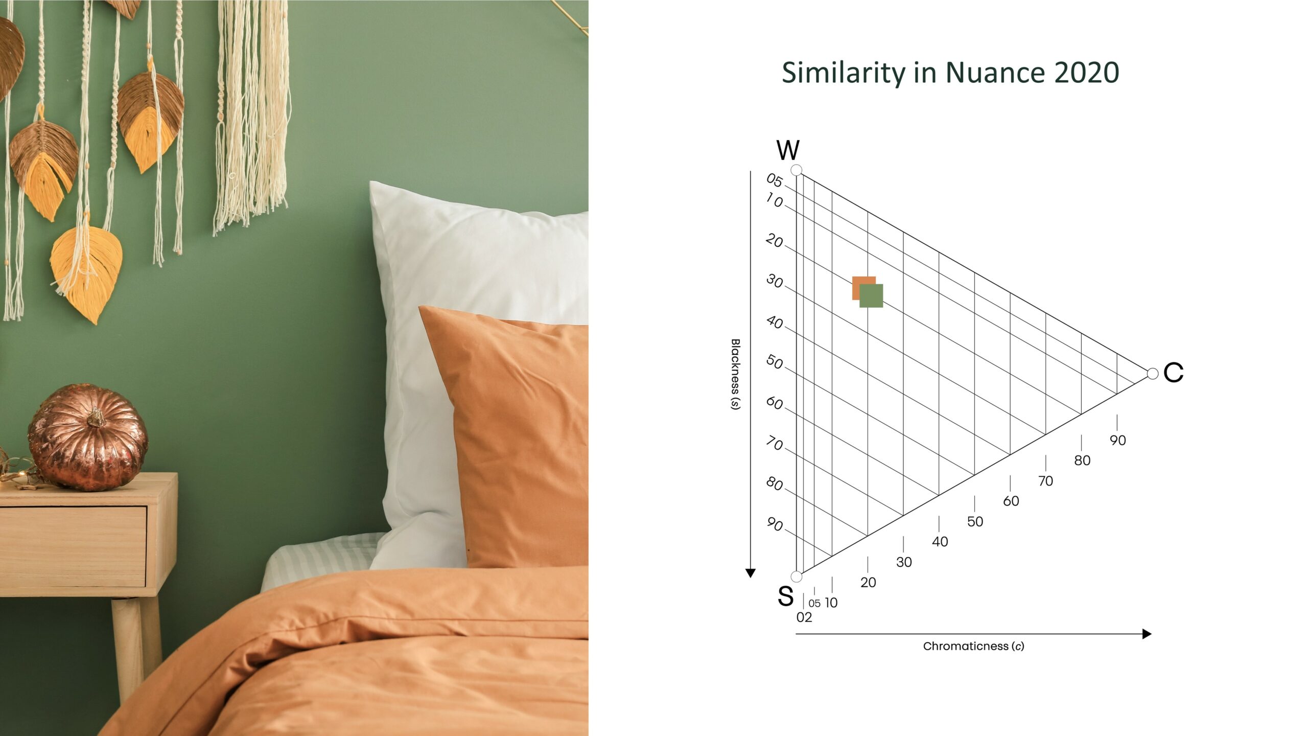
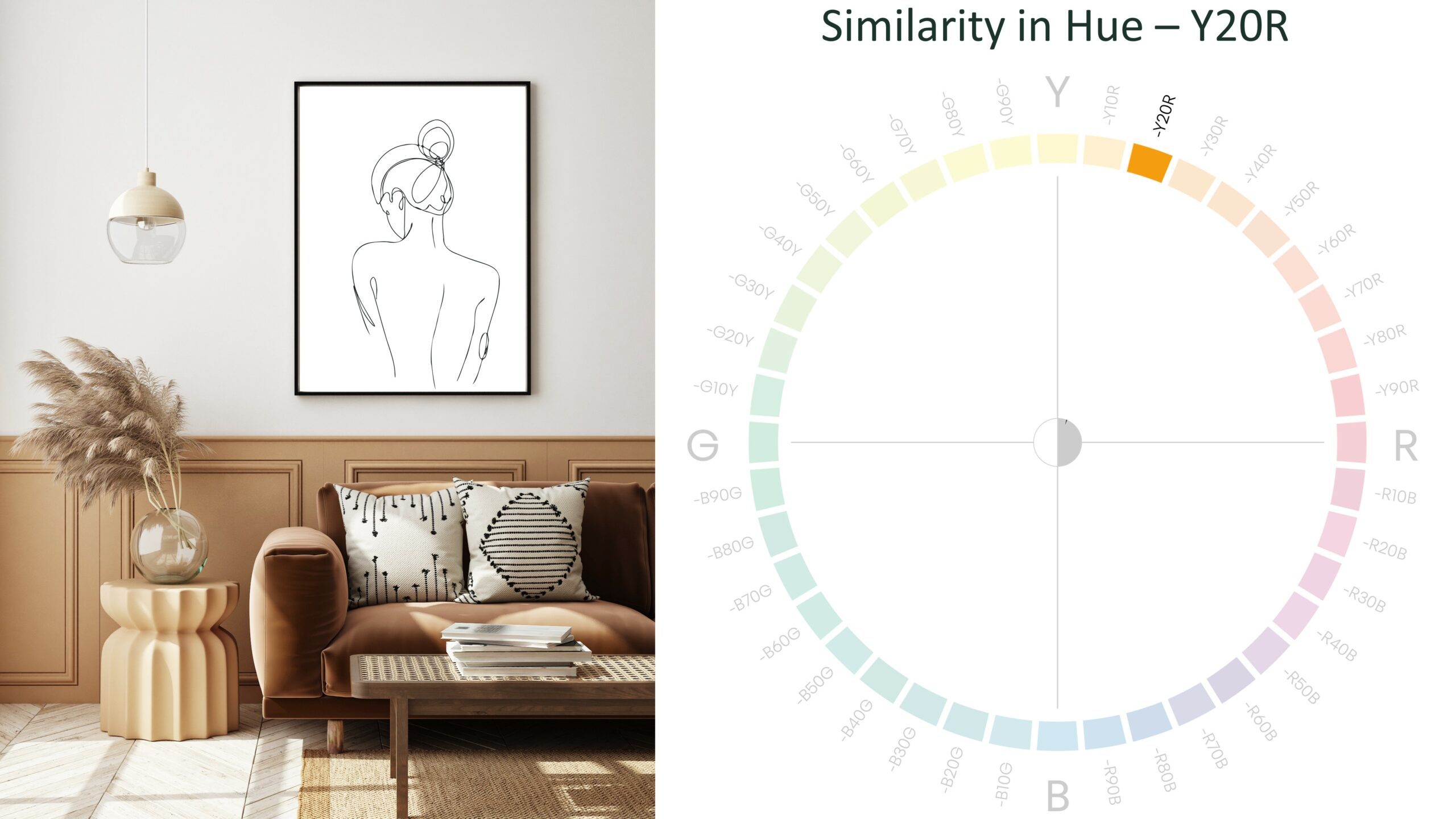
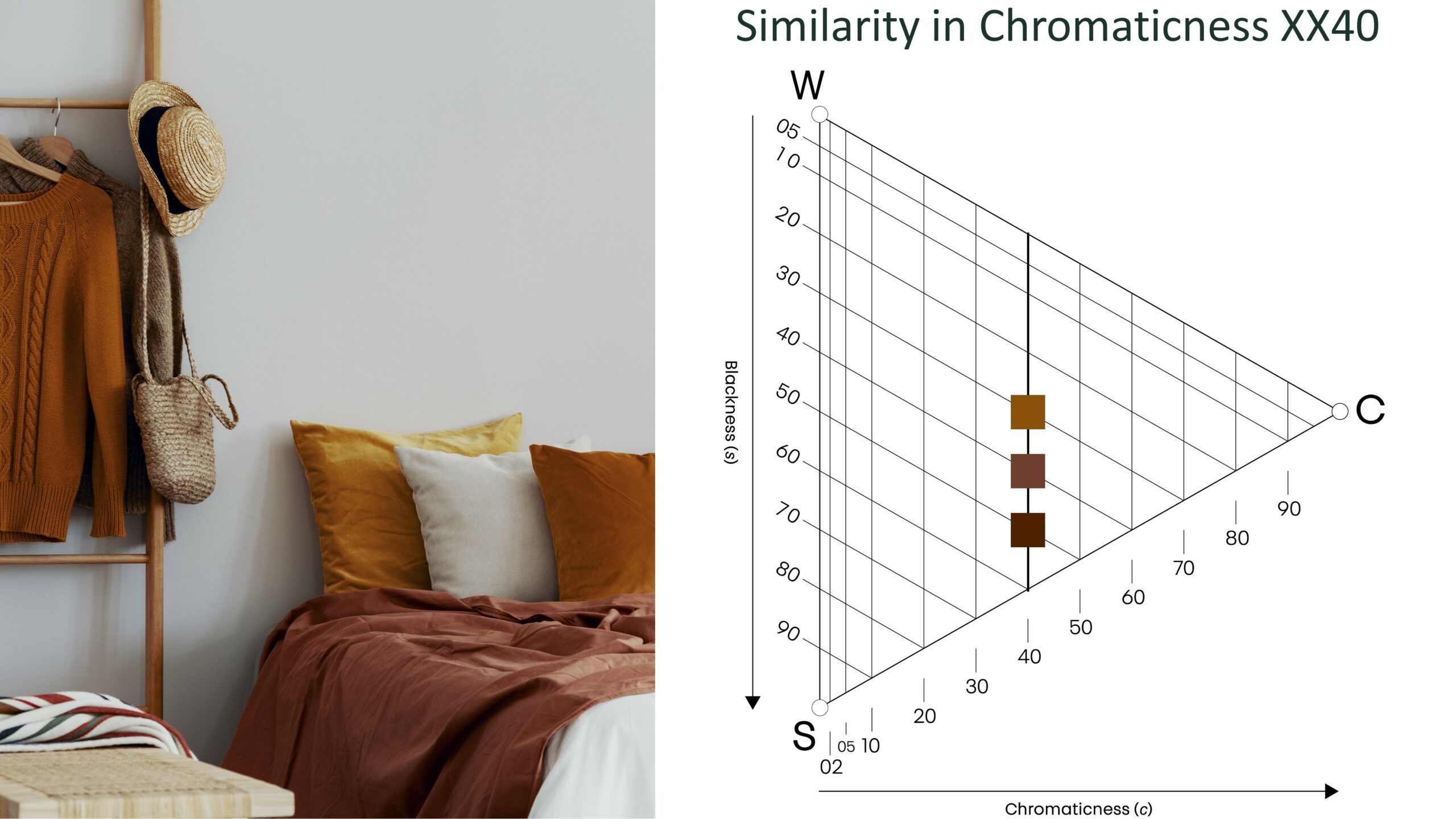
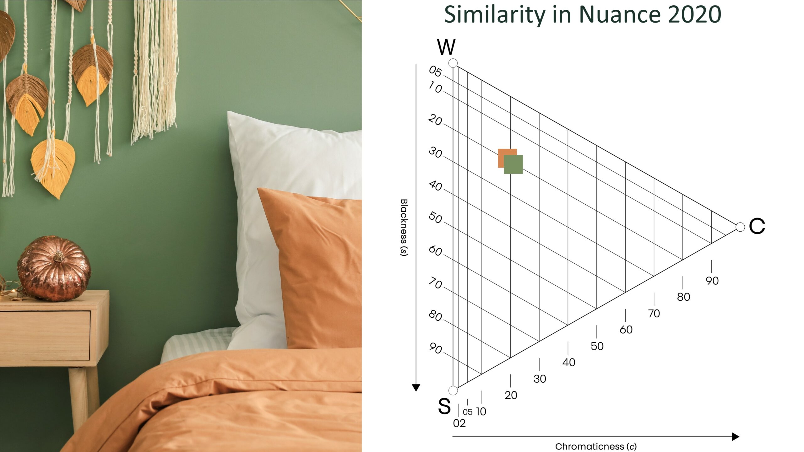
Similarities could mean the exact same nuance or the same blackness, whiteness or chromaticness. Even colors that are closely related to each other, maximum 10 steps in the NCS Colour Circle, will be perceived as harmonious and therefore create a beautiful color combination.
Contrasts can also create harmonious combinations, just like complementary colors. Complementary colors are colors that are on the opposite sides in the NCS Colour Circle.
Contrasts can also create harmonious combinations, just like complementary colors. Complementary colors are colors that are on the opposite sides in the NCS Colour Circle.
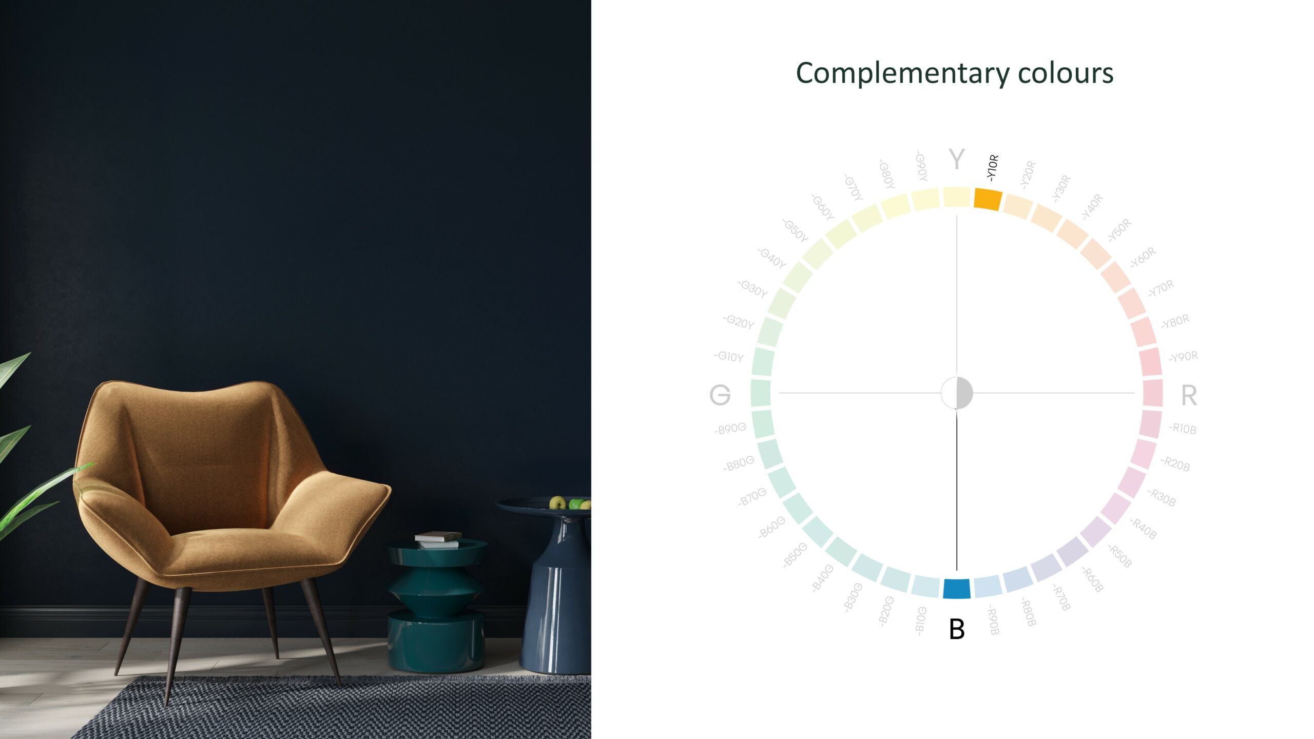
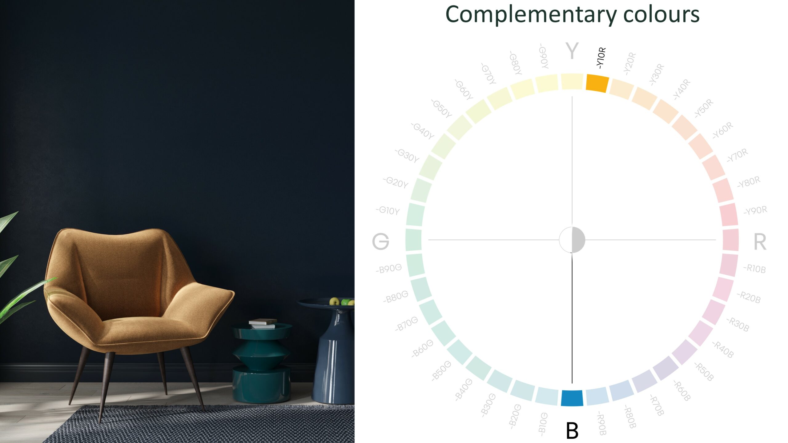
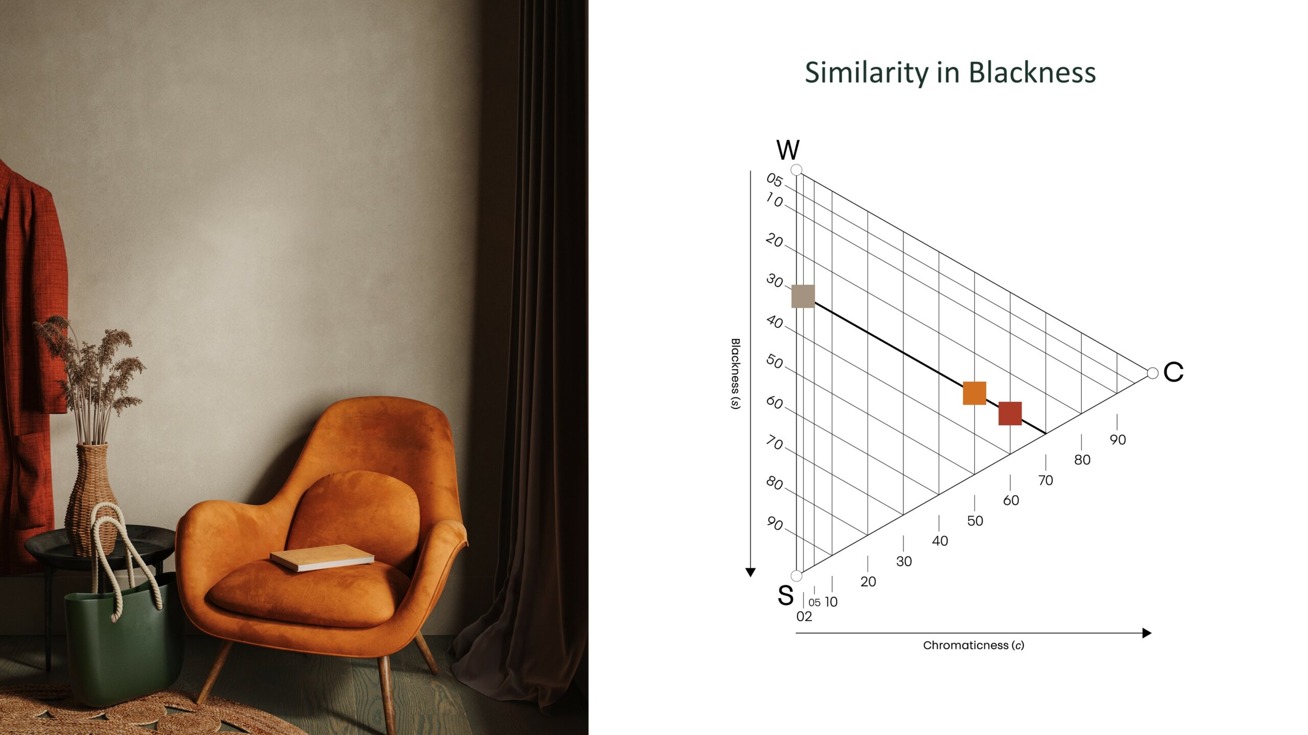
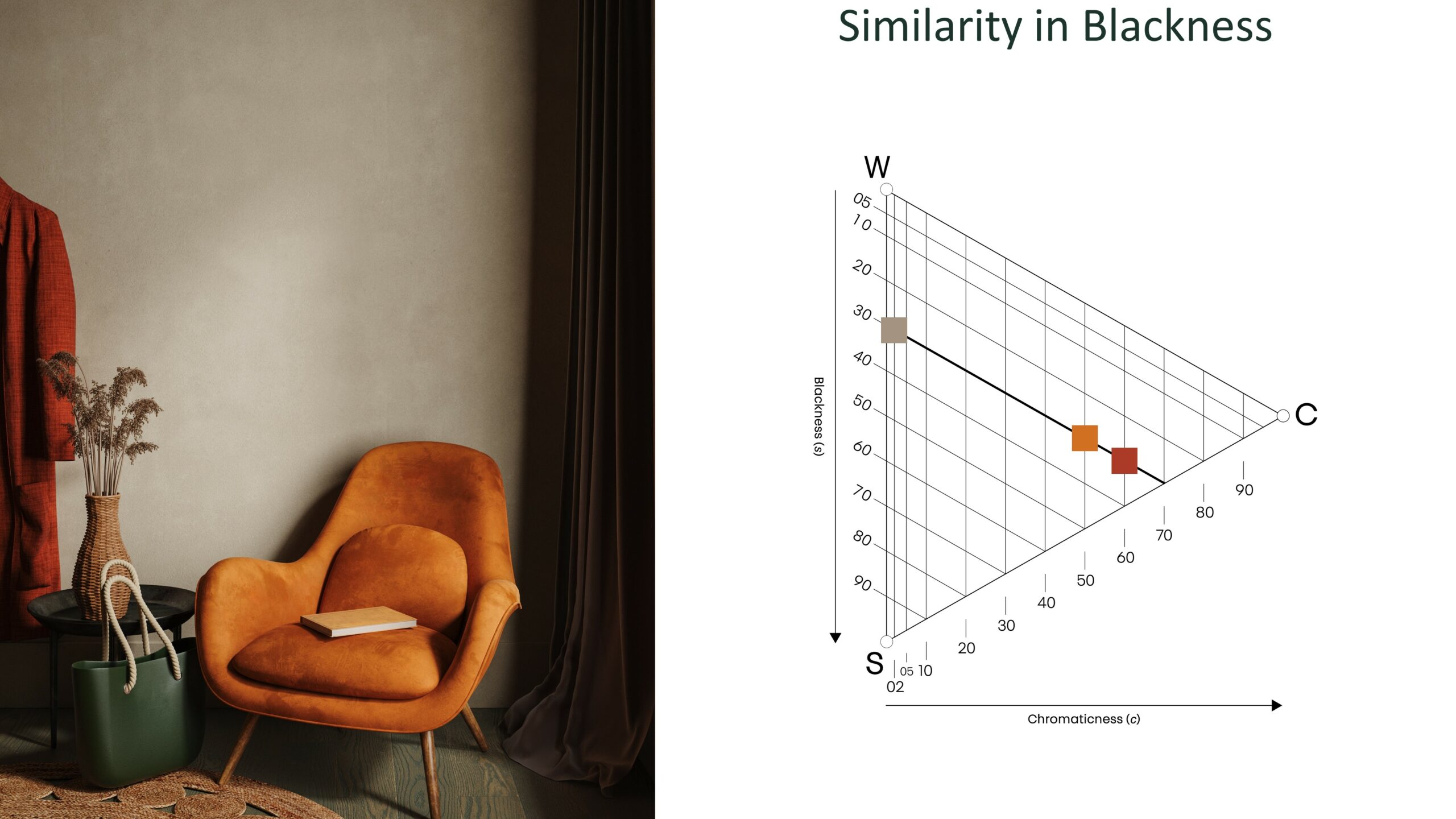
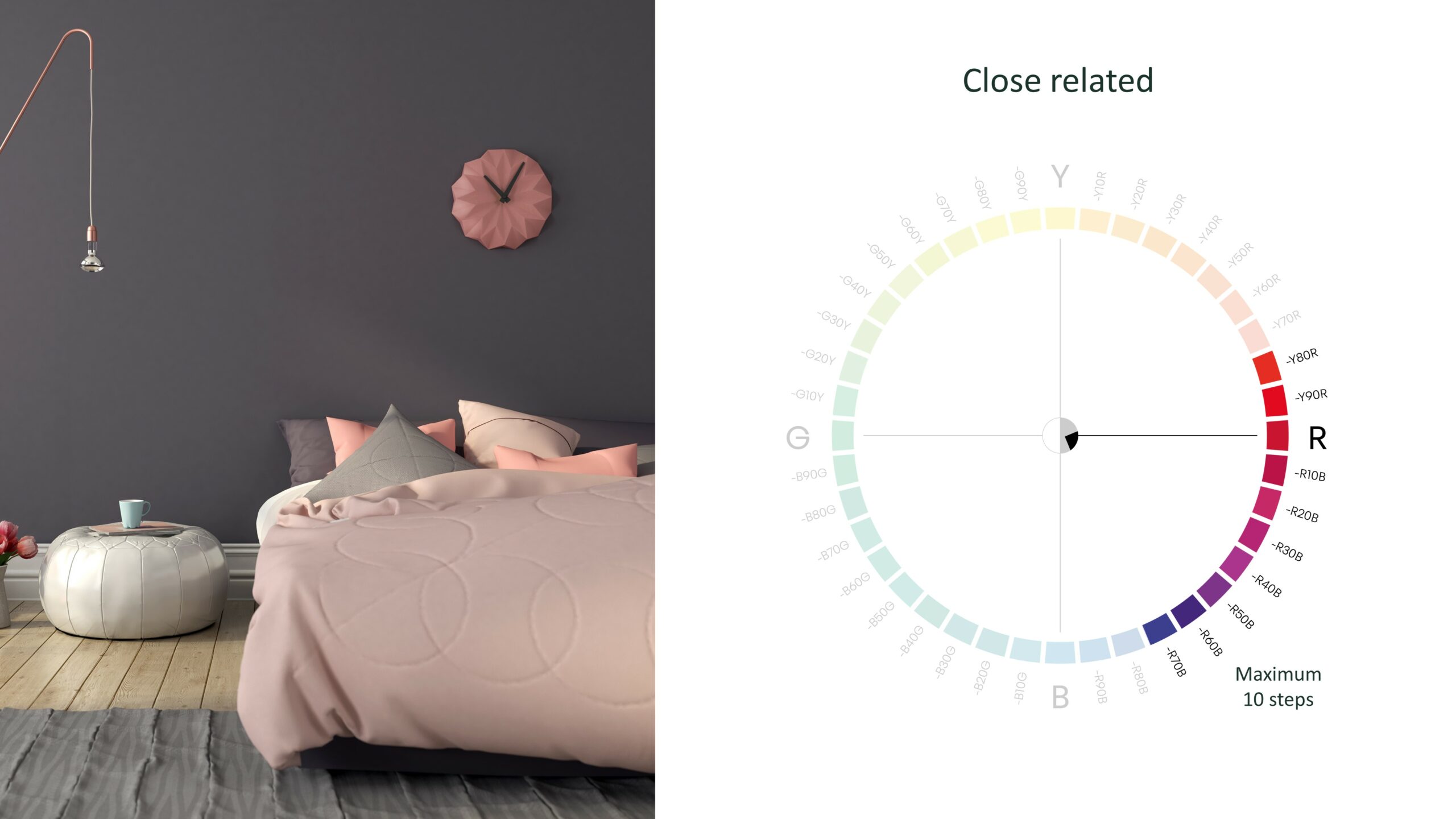
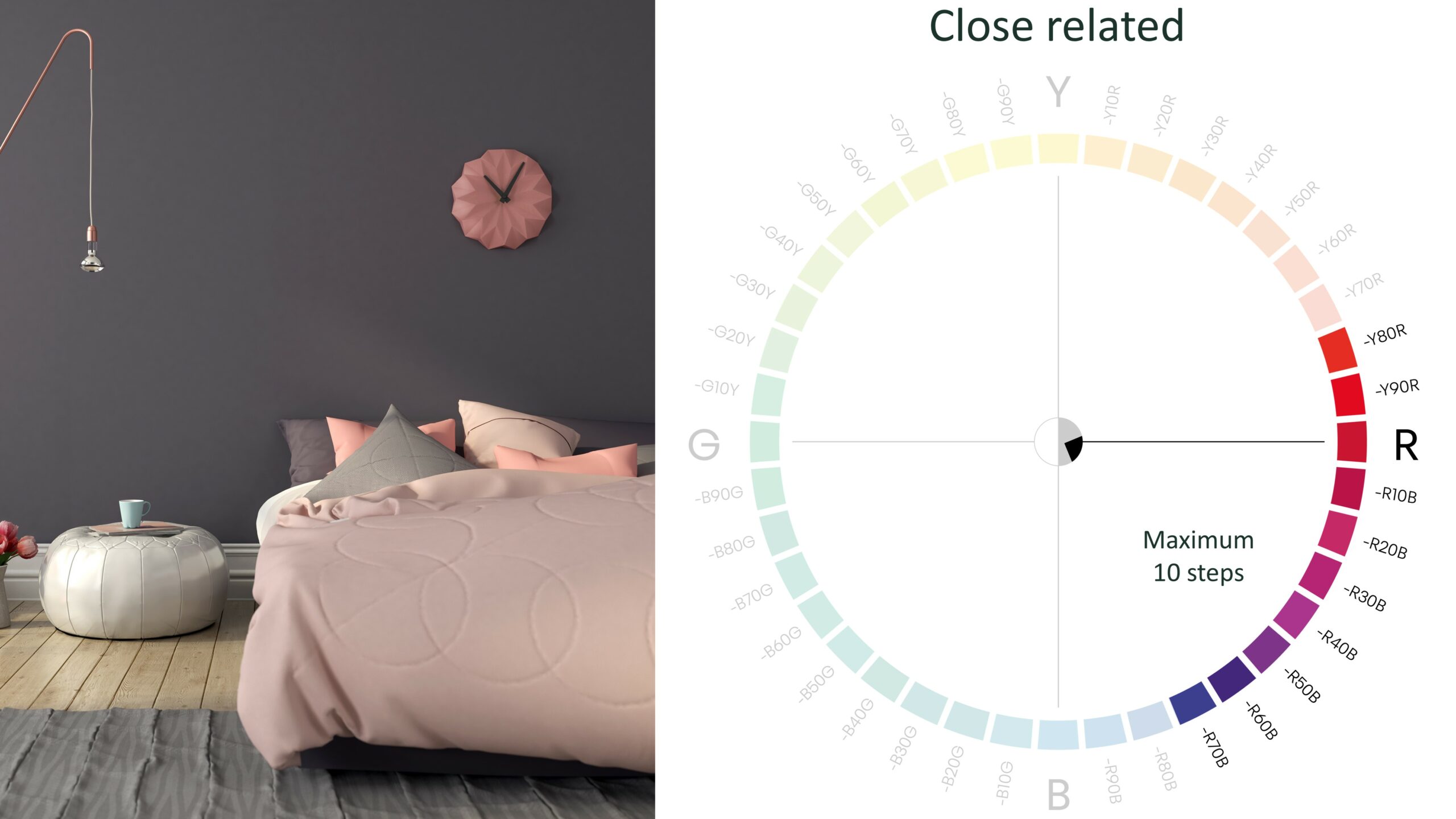
In this example they have used the same whiteness, and it creates an interesting combination as the blackness and chromaticness are different. This is a combination that changes a lot depending on the whiteness value.
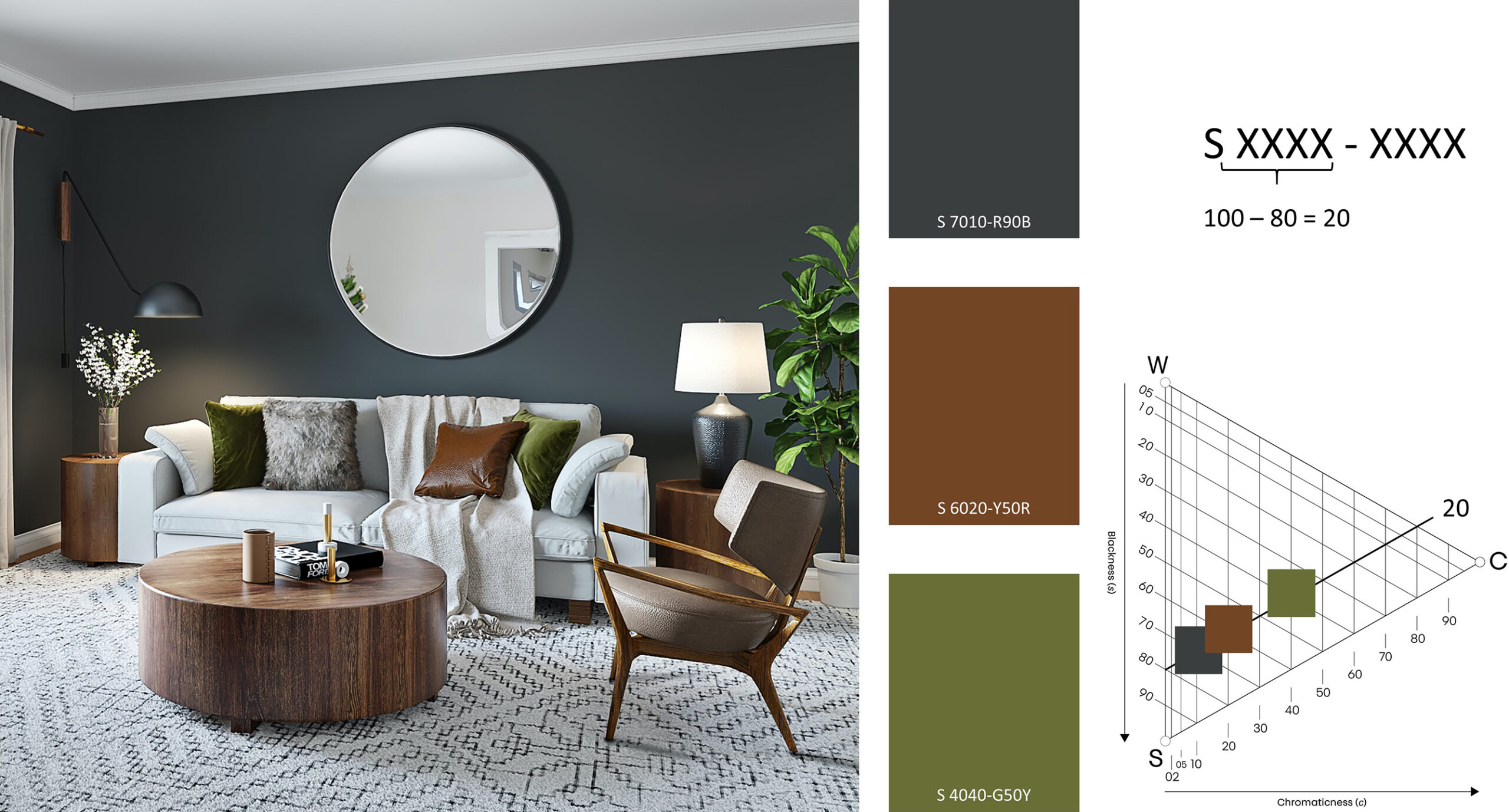
Color areas and themes
The NCS system is a great tool when talking about color and understanding your clients’ needs and desires. When talking to your client it is easier if you understand the color areas in a triangle, so that you can isolate what feeling your client is seeking through color. Is it pale colors and the feeling of softness that they are looking for?
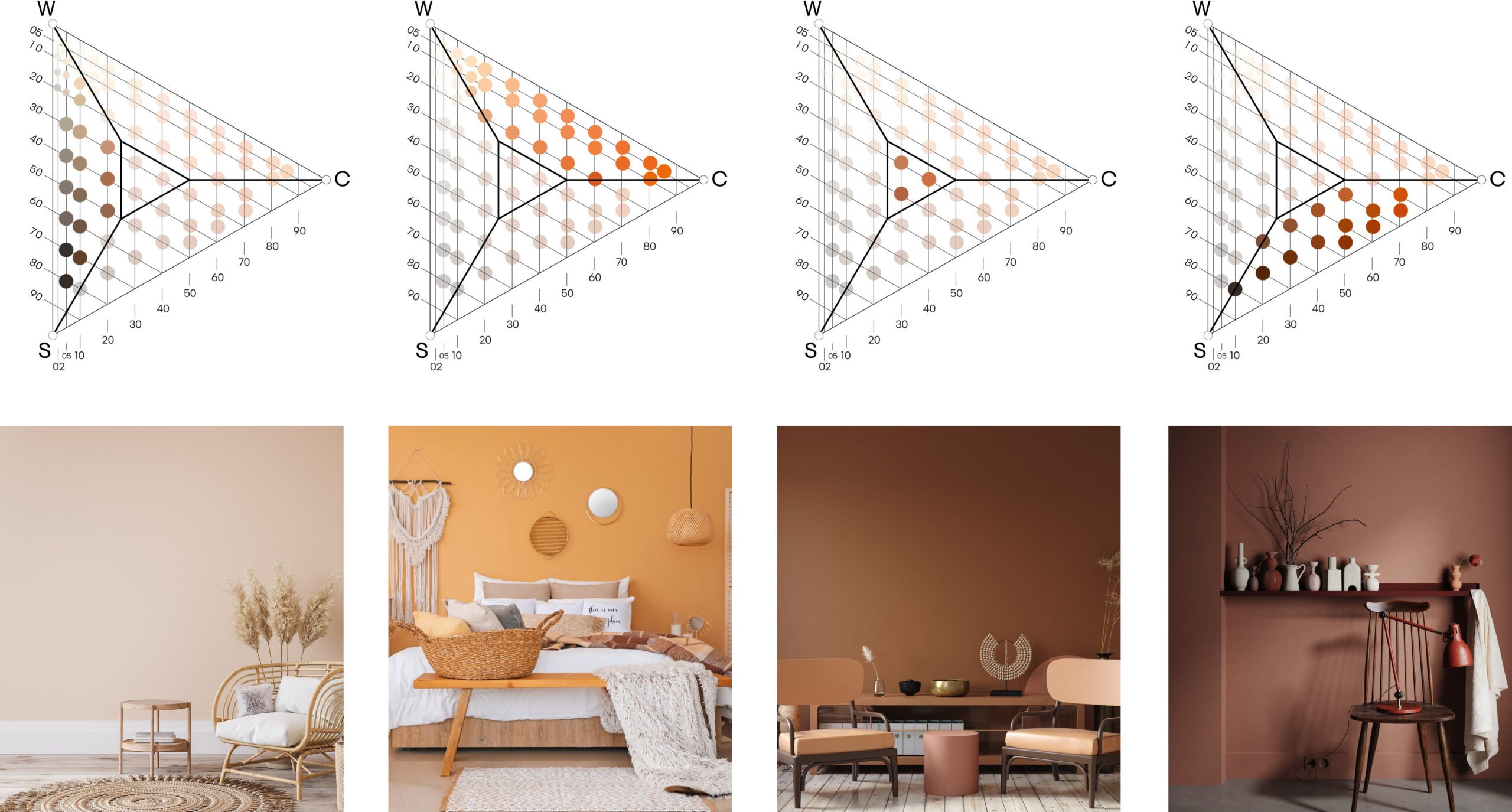
In one of our products, we help you divide the colors based on themes; Intense, Essential, Rich, Pale, Independent, Natural and Still, seen and explained below.
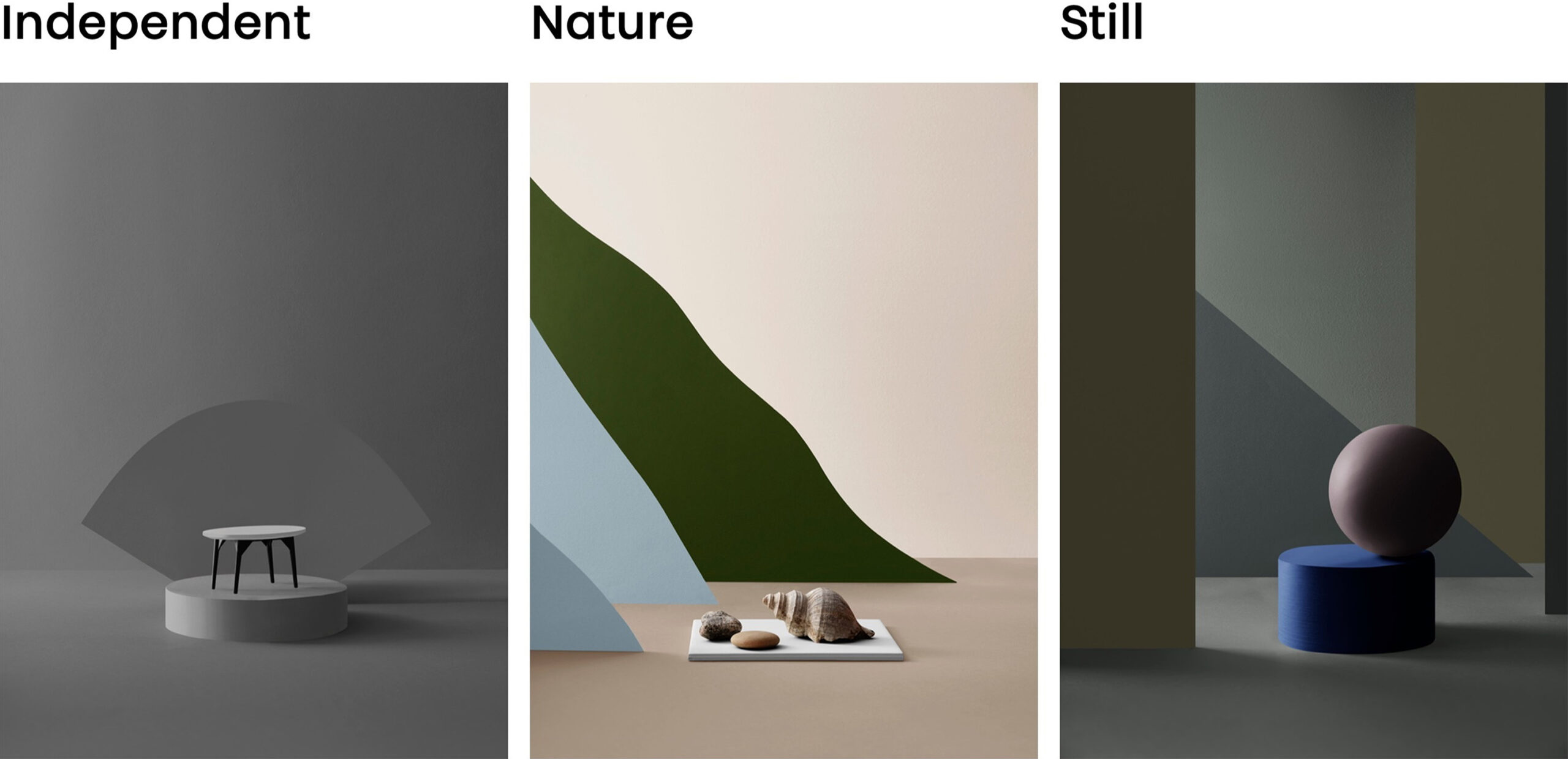
STILL & INDEPENDENT
Still and independent colors are very popular, as they bring a calm to the room. You do not need to add that much chromaticness to actually see that it is a green or blue color, and the feeling of the room become gentle. When you do not add that much chromaticness to a color, the transformation of the color between daylight and night can be extreme. Let us take an example: NCS 3005-G20Y is a low chromatic green color. On the color sample it can look pretty dull and boring, and it is hard even in some lighting to understand that this color will actually become a warmer green color on the wall. When painted on the wall and seen in full daylight in a room facing south, it looks pale and greyer but as the sun goes away, the color enters the space. It becomes warm, green, and calming.
Keep in mind that the low chromatic colors (5%) will look more chromatic on the wall. A color with 5% of chromaticness in the yellow area will look beige and a color with 5% of chromaticness in the red area might look pink. The paler colors are more impressionable than the colors with more blackness.
NATURE
Is the person living in the space a nature-lover who would like to invite a bit of the outdoors inside? Colors from nature are often well balanced in blackness, chromaticness and whiteness and are easy to relate to.
INTENSE
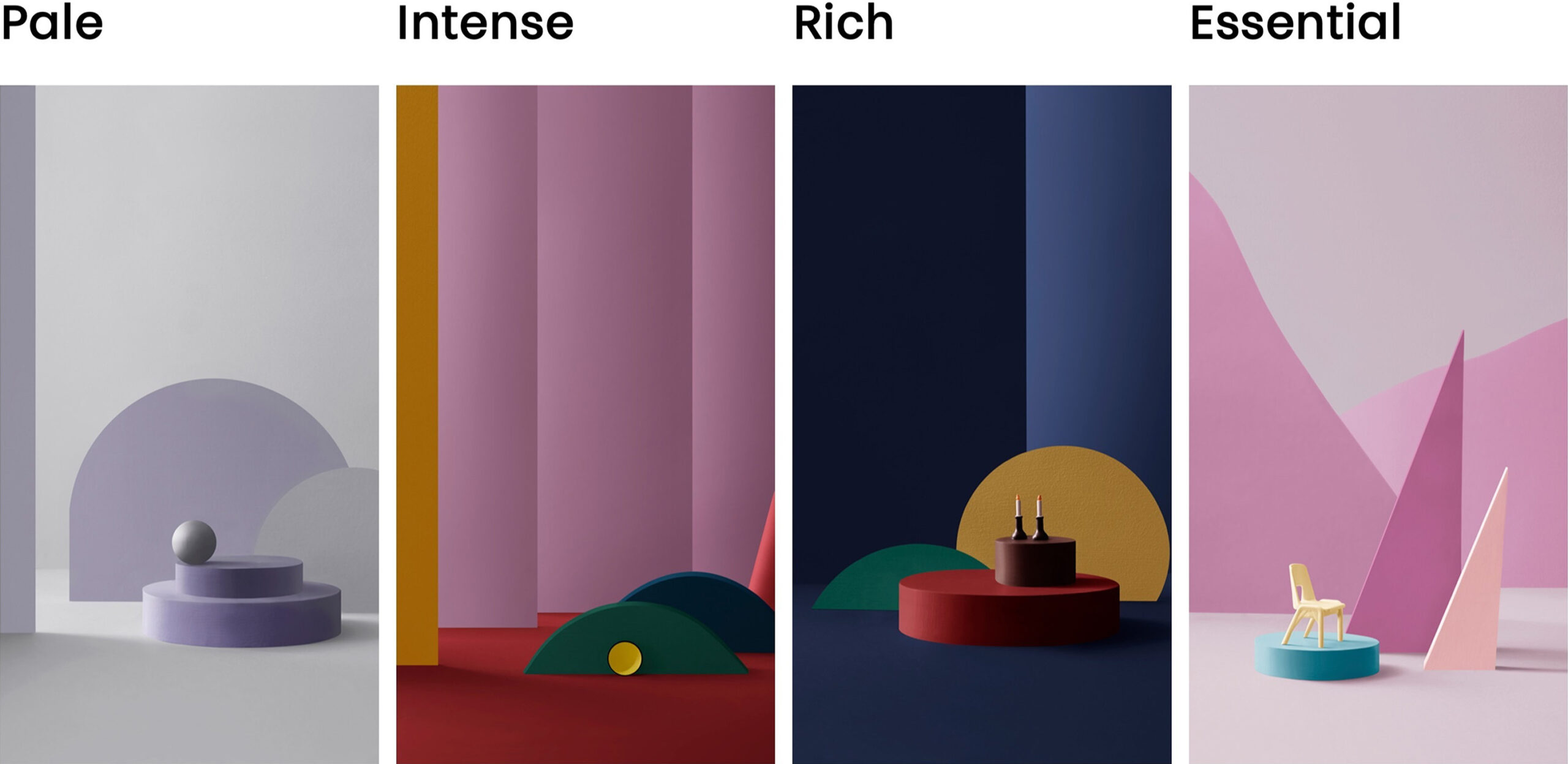
Intense strong colors are perfect for accessories and smaller objects, like yellow trims. Many people enjoy spaces that are light with colorful accessories. If you are using intense colors on larger objects, make sure that your client enjoys colorful spaces and make sure to balance it with lighter, low chromatic and darker colors so the space does not become overwhelming. Chromatic colors on larger surfaces tend to make us more active.
RICH
Rich colors have become increasingly trendy as we look to make our spaces cosier and more calm. If you do not want to paint a whole room with rich colors, they look wonderful on larger objects like a sofa or rug, or perhaps on a chest panel with lighter colors above. You can also make a feature wall.
ESSENTIAL
This is a combination of pastels and muted colors that intrigues our senses and looks beautiful on walls as well as on objects. Here the color takes a role in the interior design and depending on the blackness and chromaticness in relation to the hue, the color receives more or less attention.
PALE
Pale colors are generally perceived as light and relaxing. These colors can be found in the top left corner of the color triangle. Here you find pastels, whites, and fresh colors. Remember that research show that as long as you have light colored walls, you can paint the ceiling dark. Maybe your next project will be a painted ceiling and light-colored walls in the same hue?!
